Consumer Lifestyle · Mobile App · Branding
RT-Mart Wine App
A social wine discovery app for RT-Mart — with a KOL taster community, 5-dimension filtering, loyalty mechanics, and a full brand identity designed from zero
A social wine discovery app for RT-Mart — with a KOL taster community, 5-dimension filtering, loyalty mechanics, and a full brand identity designed from zero
RT-Mart was expanding its wine product range — but their digital presence for wine was limited to their general e-commerce platform. No dedicated discovery experience, no community, no way to communicate the product range's depth. Wine shoppers were browsing in-store or abandoning online because filtering was too blunt to be useful.
This was not just a UI project. It was a brand-and-product problem: build a wine app with its own identity, its own community logic, and a filtering system intelligent enough to serve both casual buyers and wine professionals — all within the RT-Mart ecosystem.
The brand name and visual identity were designed simultaneously — each informing the other. The name "Vinoo" (愛酒窖, ài jiǔ jiào) is a homophonic pun: "愛" (ài) sounds like "i" in English, meaning love. Combined with "酒窖" (jiǔ jiào), wine cellar — the name reads as both "I love wine cellar" and "Vinoo the wine app." Both the icon and logo express this love-meets-wine concept through shape, gradient, and cultural wordplay.
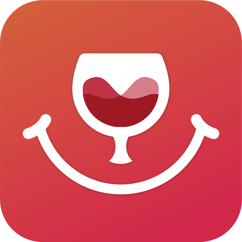

In Taiwanese consumer culture, brand names with homophonic double meanings are both memorable and socially shareable — people explain the pun to others, which becomes organic word-of-mouth. The name "愛酒窖" is a conversation starter built into the identity itself.
Before wireframing, I studied wine platforms and competitor apps, mapping their common features and end-user behaviours. The key insight: most wine apps solved either discovery or community — rarely both. The opportunity was to design a system where social mechanics and product filtering reinforced each other: community creates trust, trust drives exploration, filtering makes exploration useful.
Before either visual direction was explored, the app's information architecture and core flows were mapped in wireframe. This phase established the page hierarchy, navigation model, and feature groupings that both Style A and Style B would later share. The wireframe also served as a client alignment tool — agreeing on what the app does before discussing how it looks.
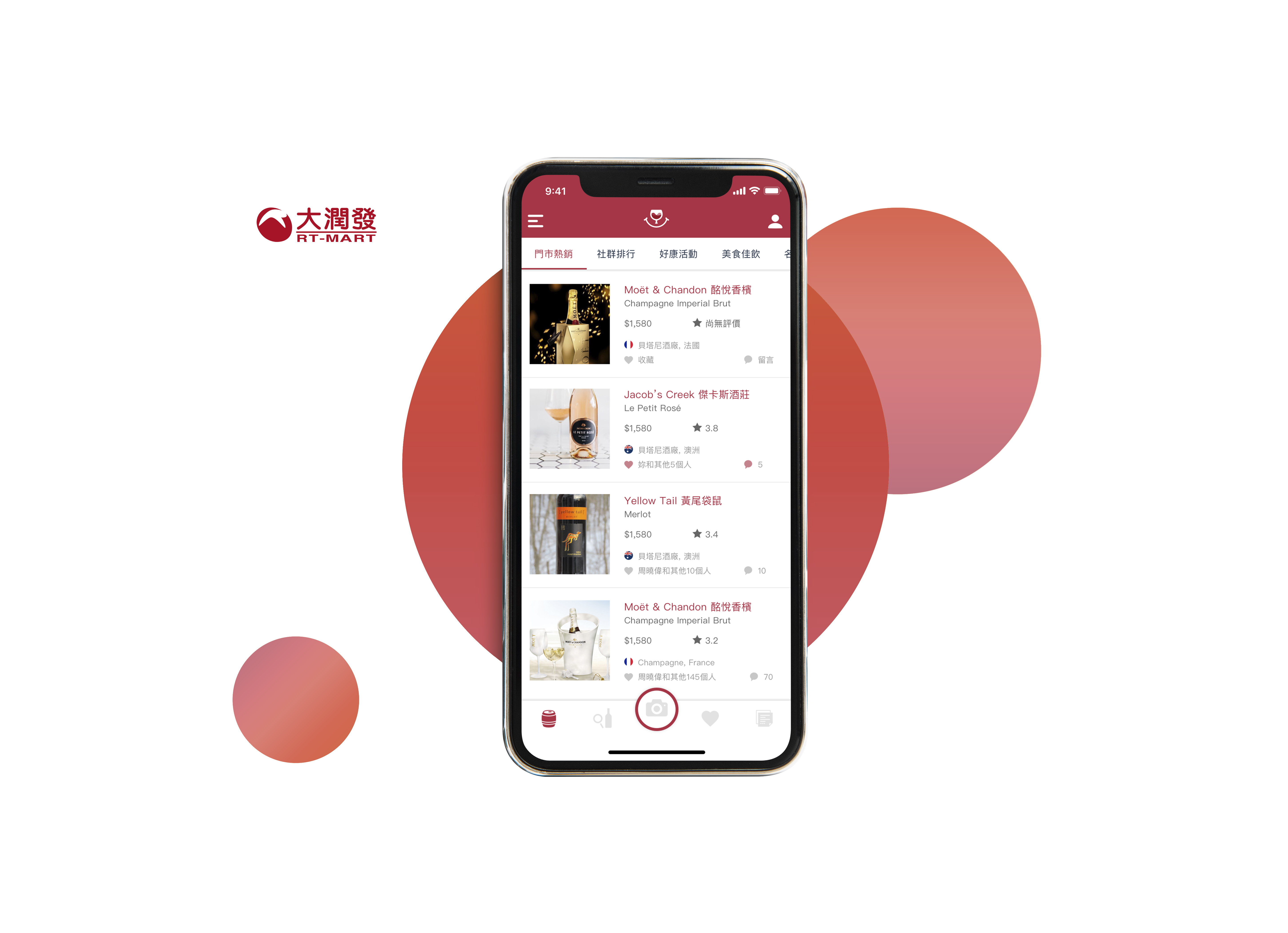
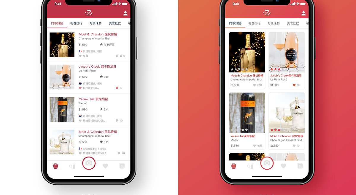
The app was presented in two complete visual directions — allowing RT-Mart to choose the emotional register that best fit their brand positioning. Both share the same IA and feature set; only the visual language differs.
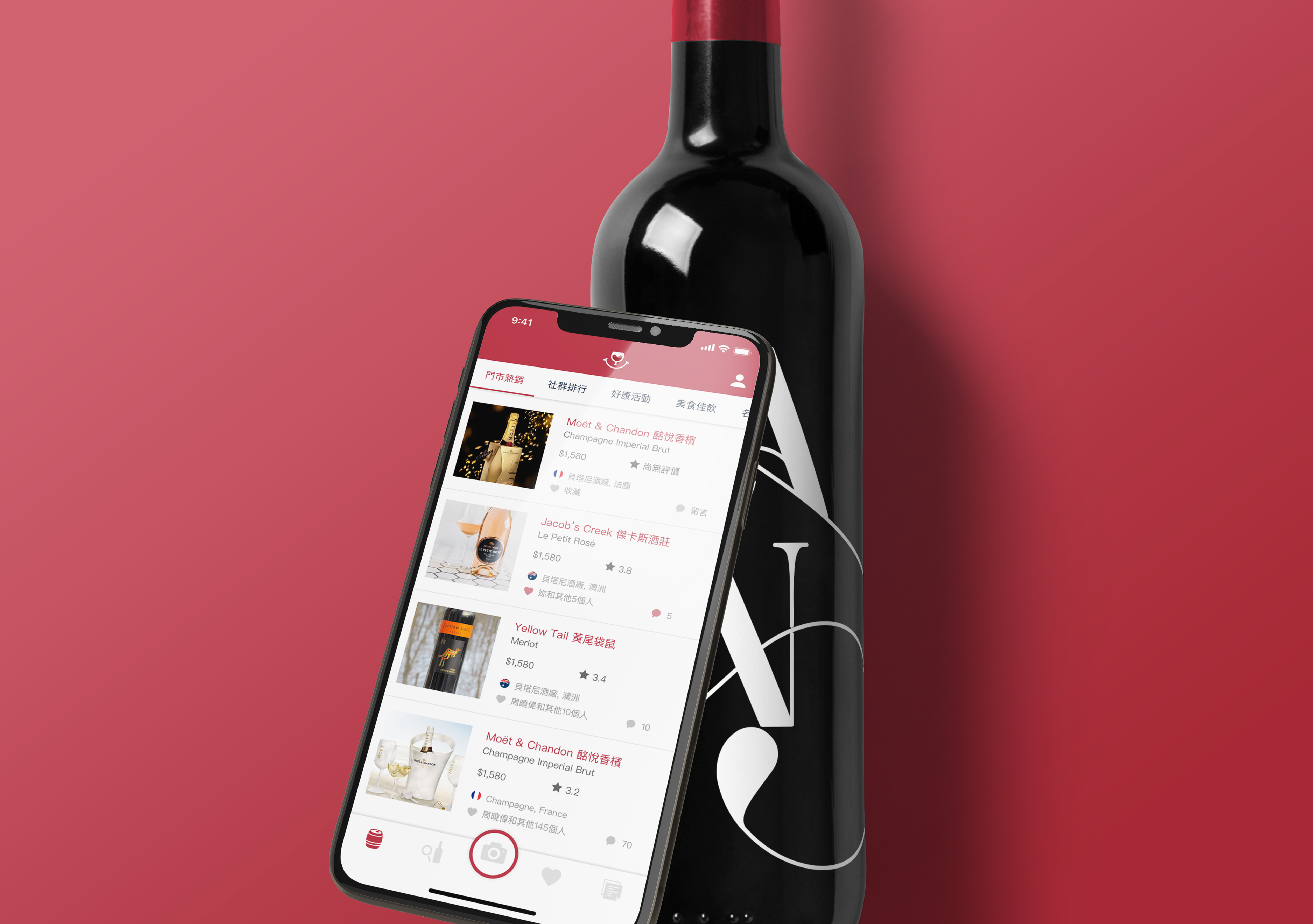
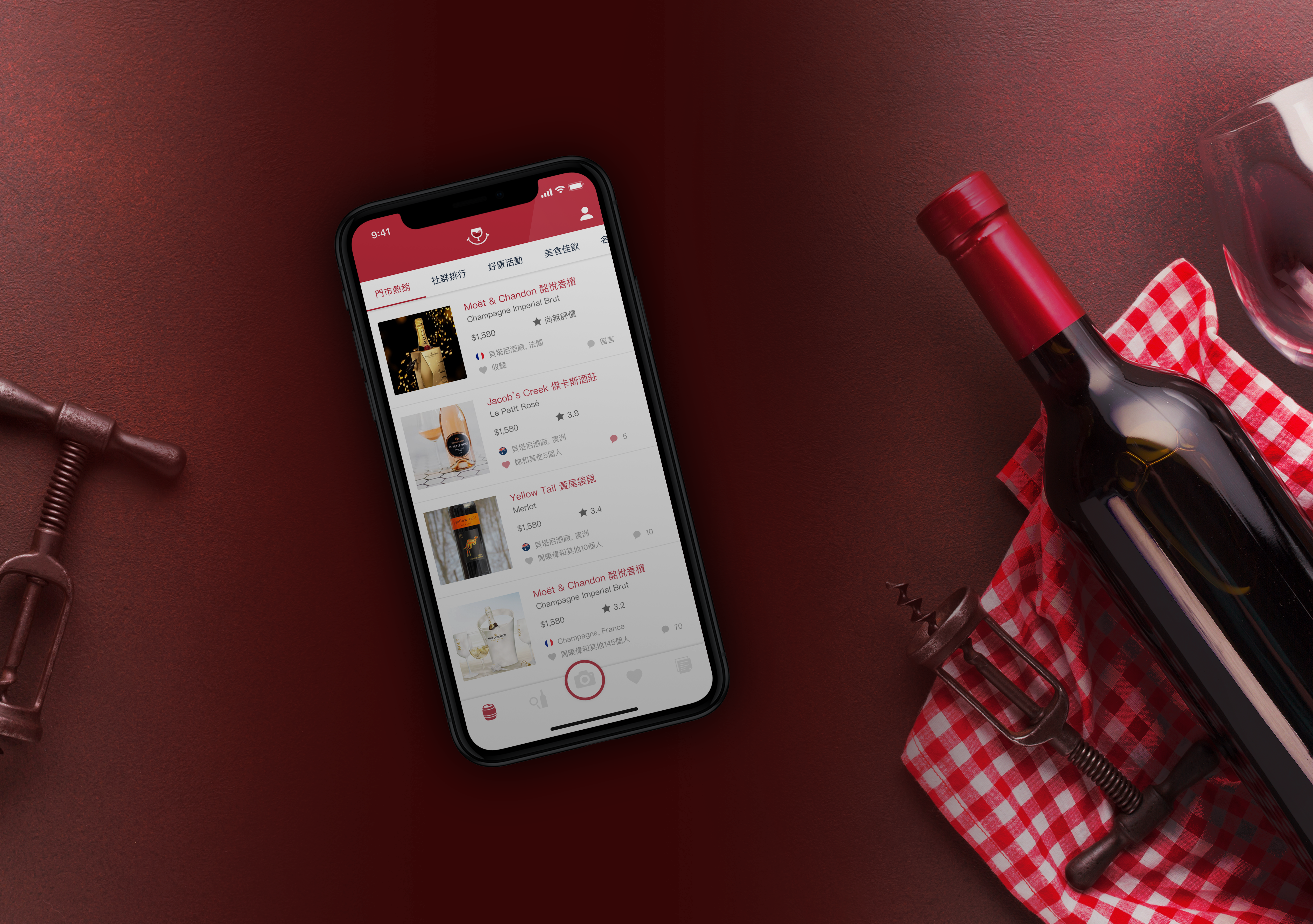
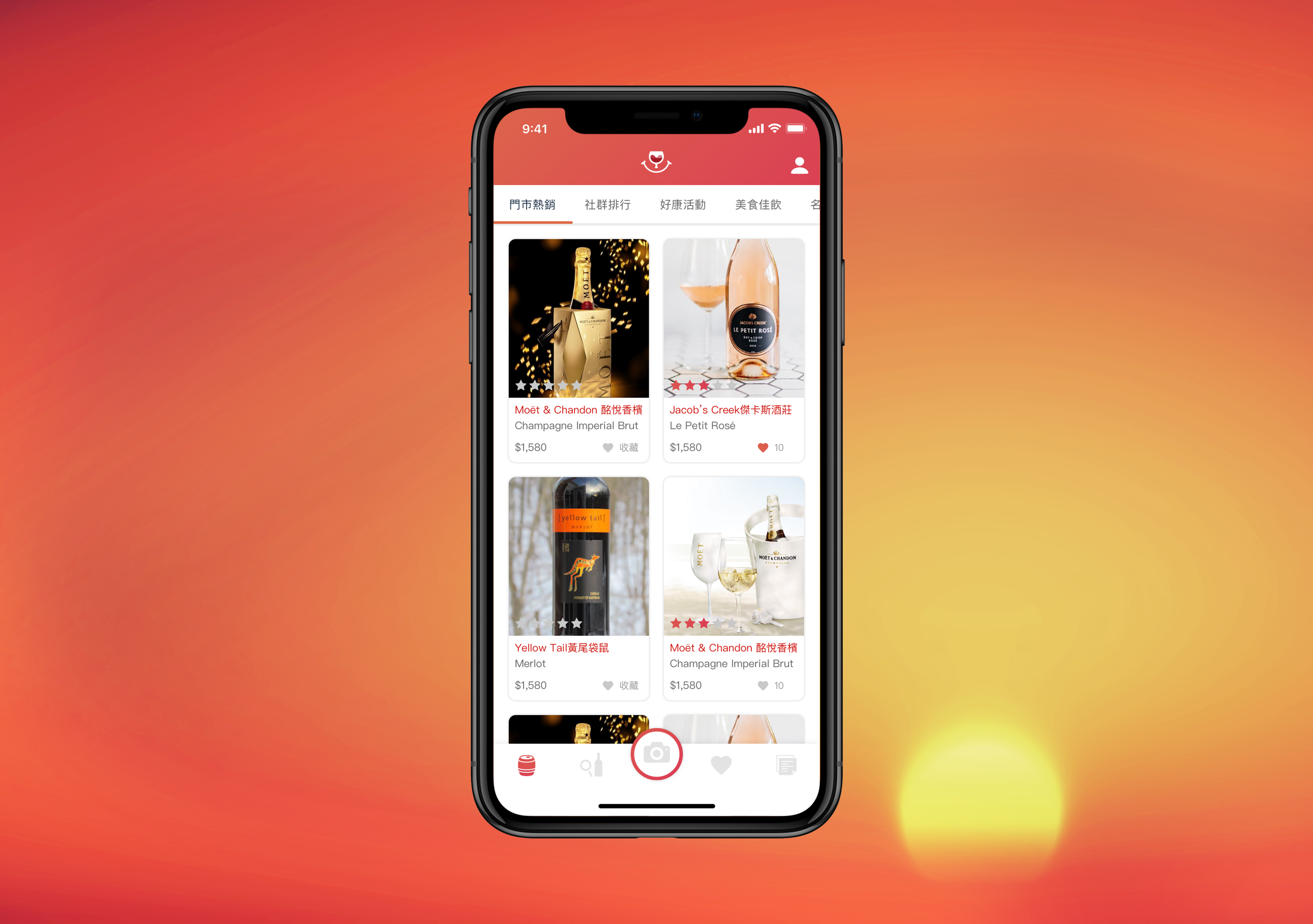
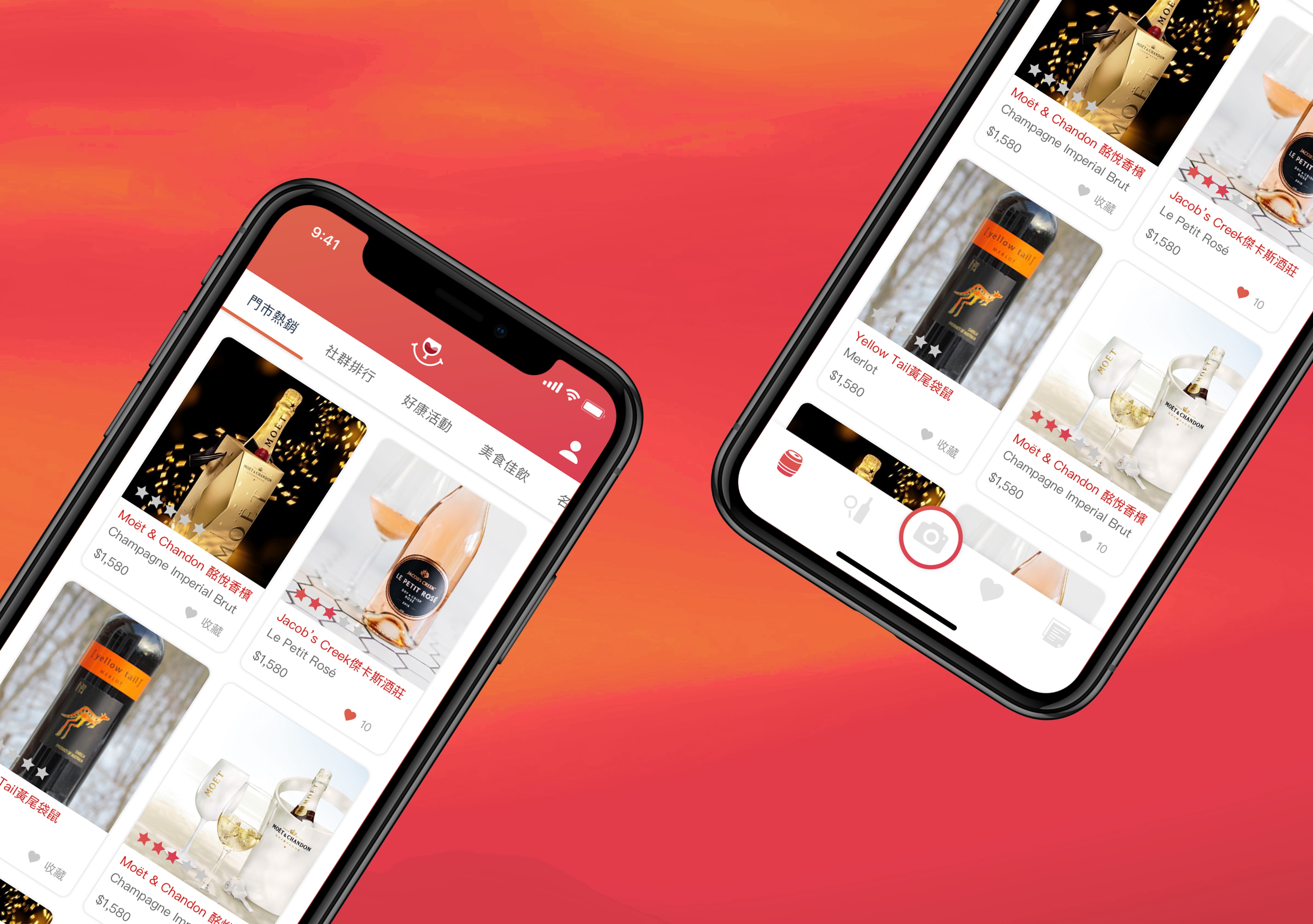
A single visual direction presented as "the answer" limits client input and risks misalignment with the brand team's vision. Two fully realised directions — each with a clear strategic rationale — give the client a genuine choice that's informed by design thinking, not just preference. The decision becomes a conversation, not a guessing game.
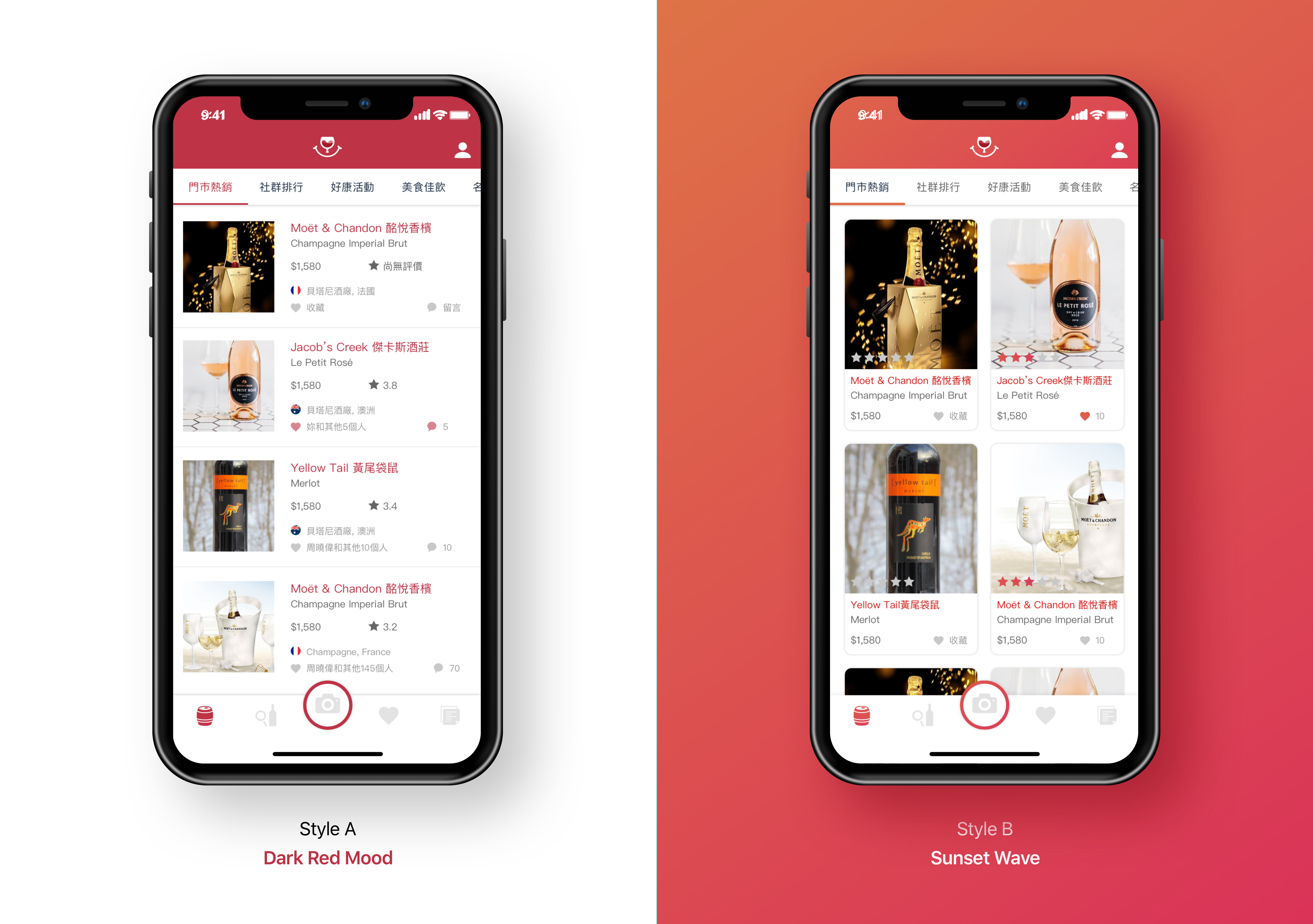
Both visual directions share the same brand gradient — rosé champagne to deep burgundy — expressed differently at the UI level. Style A uses it as an accent against dark backgrounds; Style B uses it as the primary surface colour throughout. The gradient is the throughline that keeps both directions feeling unmistakably "Vinoo."
Rose champagne → Deep burgundy — the colour journey of wine from light to depth, from celebratory to contemplative. Applied to icon, logo, UI highlights, and CTA buttons across both directions.