Consumer Lifestyle · Mobile App · Hong Kong
Eslite Social App
Social book discovery app for Eslite HK — community reviews, two complete visual styles, and a dark mode built for readers
Social book discovery app for Eslite HK — community reviews, two complete visual styles, and a dark mode built for readers
Eslite is one of Asia's most beloved bookstore brands — a cultural institution that expanded beyond books into stationery, fashion, food, and crafts. For its Hong Kong presence, Eslite needed a mobile app that could serve as a community platform for book lovers, while also reflecting the brand's evolution into a broader lifestyle destination.
The core tension: how do you honour the tactile, nostalgic experience of browsing a physical bookstore — the smell of ink, the weight of a new spine, the quietness of the stacks — in a digital product? And how do you extend that to Eslite's newer lifestyle identity without alienating the core literary audience?
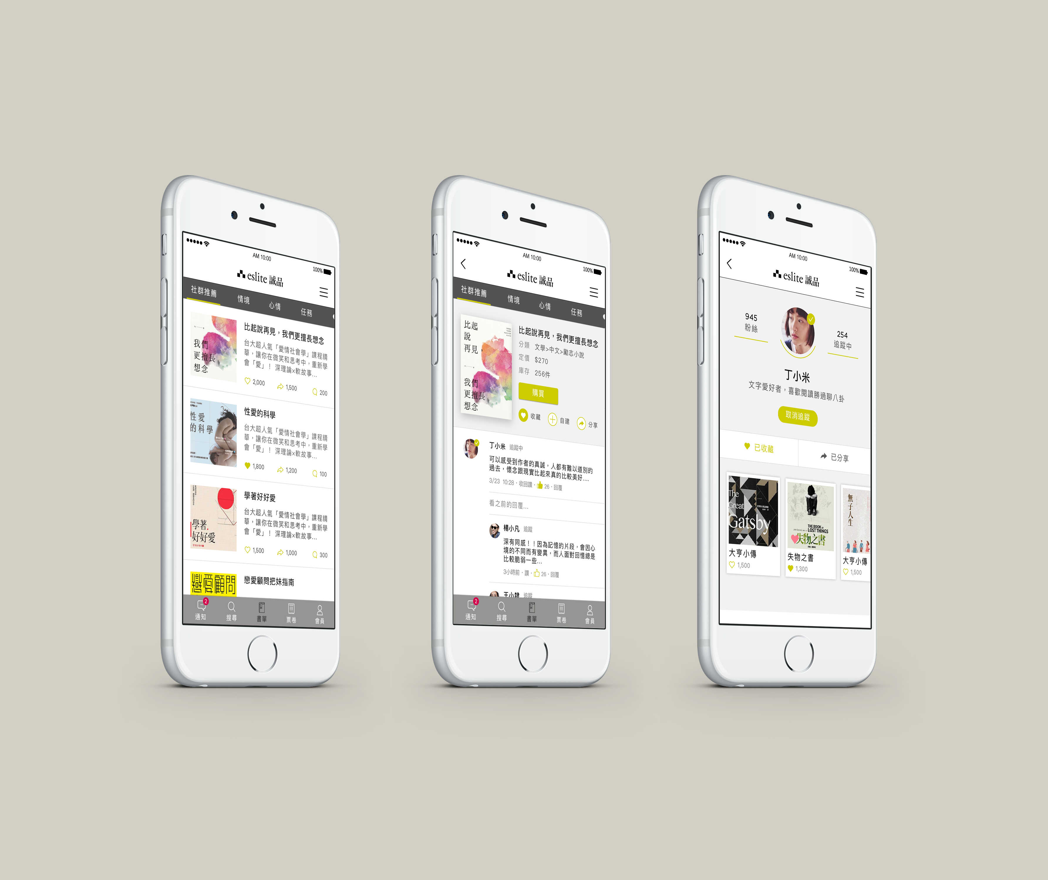
Book lovers are intrinsically social — they recommend, argue, annotate. I led with a community review layer rather than a product catalogue, so the app feels like a reading club, not a retail channel.
Rather than committing to one aesthetic before stakeholder alignment, I designed two production-ready visual styles — Modern Cultural and Paper Nostalgia — each targeting a distinct facet of Eslite's brand identity.
Book readers read at night. I treated dark mode not as a toggle afterthought, but as a dedicated reading-optimised experience with its own contrast ratios, type sizing, and ambient colour palette.
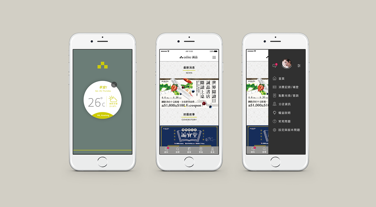
When we think of Eslite today, it's not just a bookstore — you can find modern stationery, local fashion brands, mini craft stores. It combines merchandise with modern culture, where diverse groups of people gather around quality living. This direction visualises that evolution.
Linear shapes and geometric patterns communicate the cosmopolitan breadth of modern Eslite — a space for readers, designers, travellers, and tastemakers alike. The visual language is intentionally non-literary: it signals that this app is for your whole lifestyle, not just your bookshelf.
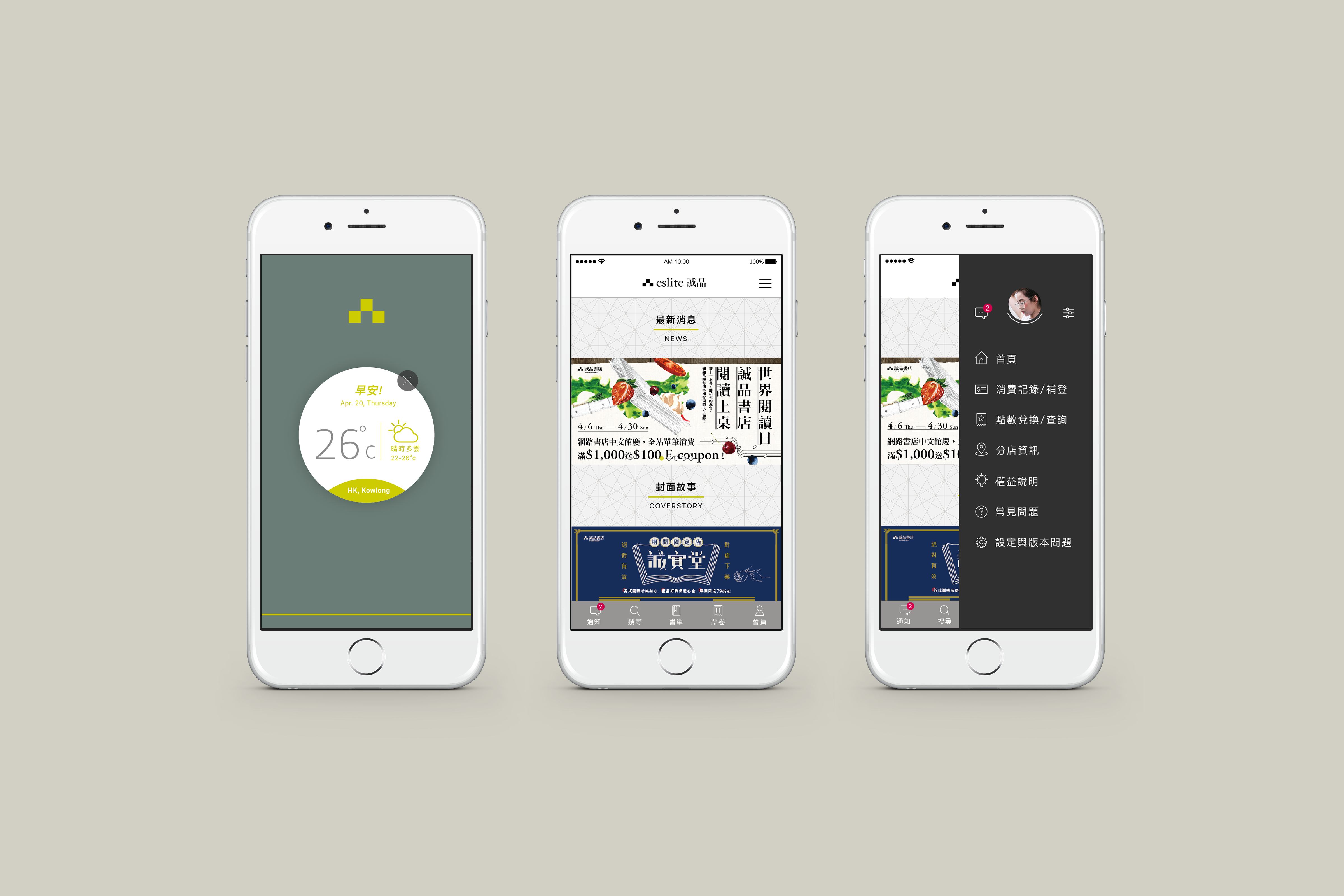
The community section lets readers write structured reviews, follow other readers' shelves, and receive personalised recommendations. New arrivals and curated lists are surfaced through a feed model — familiar to social app users, but anchored in literary intent.
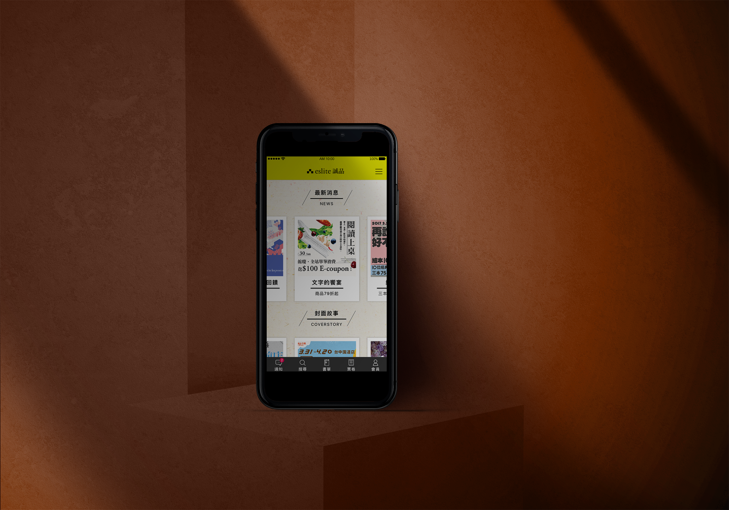
People who love reading often love the physical book itself — the ink-paper smell, the texture of a magazine cover, the quiet footsteps inside a library. This direction doesn't try to replicate those sensations digitally; it constructs a visual atmosphere that resonates with them.
Where Modern Cultural accelerates, Paper Nostalgia slows down. The visual system uses warm earthy tones, texture-evocative background treatments, and serif-inflected typography — giving every screen the quality of a well-worn reading journal.
Dark mode was a brief requirement, but I treated it as a product feature in its own right. A reader finishing a chapter at midnight has very different needs from a shopper browsing new arrivals at lunch — the interface should know the difference.
Rather than inverting colours with a system toggle, I designed dark mode with its own visual logic: reduced blue-light emission, generous line spacing, warm dark backgrounds (not pure black) to soften contrast, and type sizing recalibrated for sustained nocturnal reading.
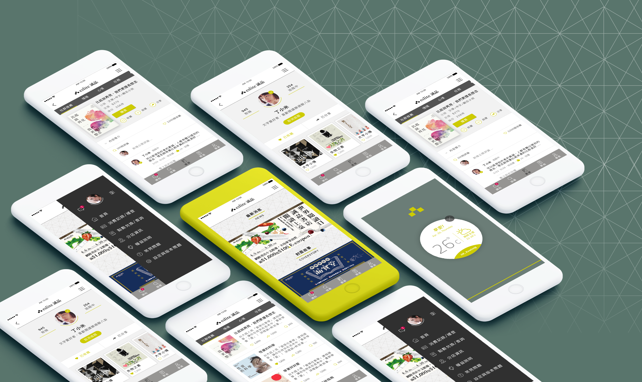
Both style directions at scale — one shared UX architecture, two distinct identities
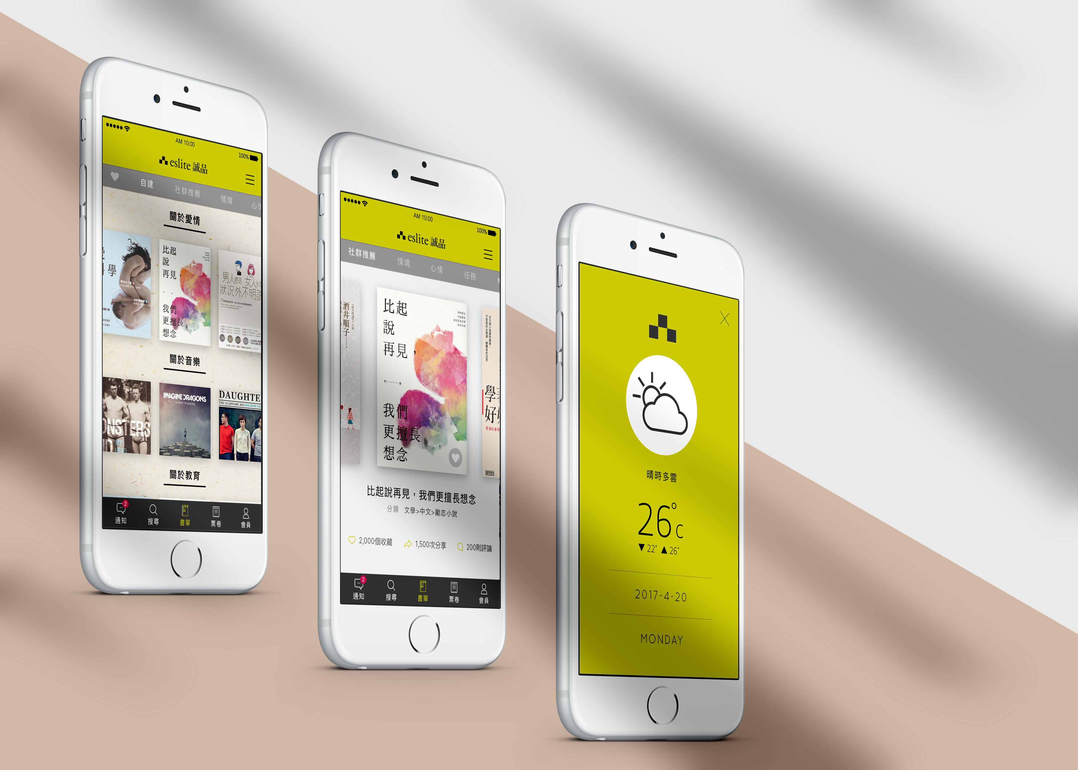
Both visual styles were built on the same component library and spacing grid, with only colour tokens and typeface weights swapped between them. This meant presenting two fully production-ready directions to the client — without doubling the design effort.