01 · Context
Two broken markets — one product to fix both
Warmsun Hair Products saw a gap on both sides of the salon industry. Customers had no reliable way to discover and book qualified freelance stylists near them — they relied on word of mouth, outdated directories, or fixed-chair salons that didn't reflect the growing freelance culture in beauty. Meanwhile, skilled freelance stylists had nowhere to find available salon chairs to rent, and no platform to build and grow their independent practice.
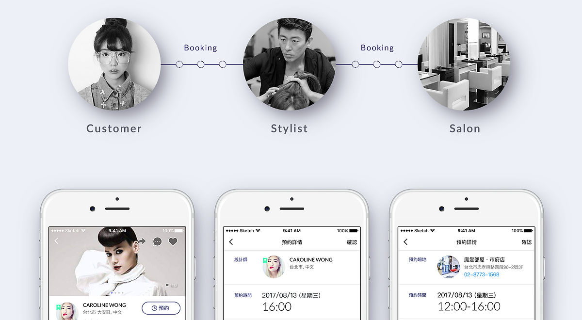
The insight: these two problems are the mirror image of each other. A platform solving one side automatically feeds the other. This was a dual-sided marketplace design — which meant designing two separate products that needed to communicate in real-time, while each feeling completely native to its user.
Two User Groups
Completely different mental models, one ecosystem
Two Apps
Shared design system, distinct UX identities
Real-Time Match
Booking logic connecting both sides instantly
02 · Two Apps, One Ecosystem
Walker finds. Maker fills.
The two apps serve opposite entry points to the same transaction — but users never feel like they're using "half a product." Each app is designed as a complete, standalone experience: Walker is a discovery and booking tool; Maker is a business operations tool. The connection between them happens in the background.
Core job-to-be-doneFind the right stylist, at the right place, right now
- Location-based stylist map with portfolio and pricing
- Real-time availability and instant booking confirmation
- Trust built through portfolio preview and reviews
- Push notifications to manage upcoming appointments
Core job-to-be-doneWork anywhere, own your schedule, grow independently
- Real-time discovery of available salon chairs nearby
- Client scheduling and booking management dashboard
- Location-independent — find slots at any partnered salon worldwide
- Revenue analytics and performance tracking
03 · UX Strategy
One visual system. Two UX grammars.
Designing a dual-sided marketplace means solving two fundamentally different information problems simultaneously. Customers need discovery and trust signals — they're asking "who should I choose?" Stylists need operational control — they're asking "what do I have, and when?" These questions require completely different interface logic, even within a shared brand.
01
Separate UX Identity — Shared Brand
Walker and Maker share typography, colours, and component primitives — but their information hierarchy is completely distinct. Walker's home screen is a discovery map. Maker's is a dashboard. Same brand, different UX grammar.
02
Trust Is Asymmetric
Customers build trust through portfolio previews, verified reviews, and visible credentials before booking. Stylists build trust through confirmed payments and client history. The same "trust" problem has two completely different solutions depending on which side of the marketplace you're on.
03
The Matching Logic Must Be Invisible
When a customer books, Maker users receive a notification — with the stylist's profile, service request, and time. Neither side needs to think about "how the connection works." The matching logic is real-time and silent: good UX makes coordination feel effortless.
04 · Salon Walker — Customer Experience
Salon Walker
Discovery-first design for customers who don't know what they want yet
Location-Based Stylist Discovery
The home screen opens as a map — not a list. Nearby stylists appear as pins with profile photos, so users immediately understand geographic proximity before reading any text. Tapping a pin expands into a preview card: portfolio thumbnail, service specialities, pricing tier, and live availability. The map is the primary navigation; filtering is secondary.
UX Rationale: visual first, filter second
Real-Time Booking with Instant Confirmation
Booking is a 3-step flow: select time slot from the stylist's live calendar → confirm service and price → receive booking confirmation with stylist contact. The calendar only shows genuinely available slots — no "request to book" ambiguity. Instant confirmation removes the anxiety of not knowing whether a booking went through.
UX Rationale: no-ambiguity confirmation
Review System — Trust Built Over Time
Reviews are tied to verified bookings only — you can only leave a review if you completed a session. This prevents fake reviews and gives Walker's rating system genuine credibility. Portfolio photos are curated by stylists and linked to specific completed services, so customers can evaluate real work, not stock imagery.
UX Rationale: verified = trustworthy
Push Reminders — Reducing No-Shows
Automated push notifications 24h and 1h before appointments, with a one-tap cancel or reschedule. Stylists benefit directly: fewer no-shows means predictable revenue. Customers benefit: fewer forgotten appointments. A friction-reducer for both sides embedded in the customer-facing app.
UX Rationale: benefits both sides
05 · Salon Maker — Stylist Experience
Salon Maker
Operations-first design for stylists who run their practice like a business
Salon Slot Discovery — Work Anywhere
Freelance stylists can browse available chairs at partnered salons nearby — or anywhere in the world. The discovery interface mirrors Walker's map approach, but instead of stylists, pins represent open salon chairs with hourly/daily rental rates, salon facilities, and available time windows. A freelancer can plan a work week across multiple salons without a single phone call.
UX Rationale: location independence
Booking Management Dashboard
The Maker home screen is a scheduling dashboard — upcoming bookings, client profiles, and pending requests in a time-based view. Stylists can accept, reschedule, or decline requests directly from the dashboard. Client profiles auto-build over time: service history, preferences noted, rebooking patterns. Every repeat client becomes easier to serve.
UX Rationale: control and predictability
Revenue Analytics — Track Growth
Monthly revenue, session count, repeat client rate, and average booking value — surfaced in a clean analytics view. This data is not a vanity feature: it helps stylists price themselves correctly, identify their best-performing services, and understand whether they're growing. For a freelancer with no HR or finance team, this view replaces a spreadsheet.
UX Rationale: data as empowerment
The hardest design problem in a dual-sided marketplace
Customers want discovery and serendipity. Stylists want predictability and control. These are opposing information needs. Solving them in the same product — without compromising either — meant designing two completely different home screen architectures that share zero layout logic, while remaining visually coherent as a family of two.