Resorts World at Sea
Enterprise · Hybrid App · Hospitality

Resorts World at Sea

Redesigning a cruise hybrid app for 45–65+ casino resort guests — simplifying bookings, rewards, and wayfinding through stakeholder-driven UX research

Client
Genting Resorts Group
Agency
Cloud Interactive
My Role
UX Designer
Timeline
2019
Platform
Hybrid App
Project Type
Optimization
01 · Project Overview

Optimising a hybrid app for casino resort guests

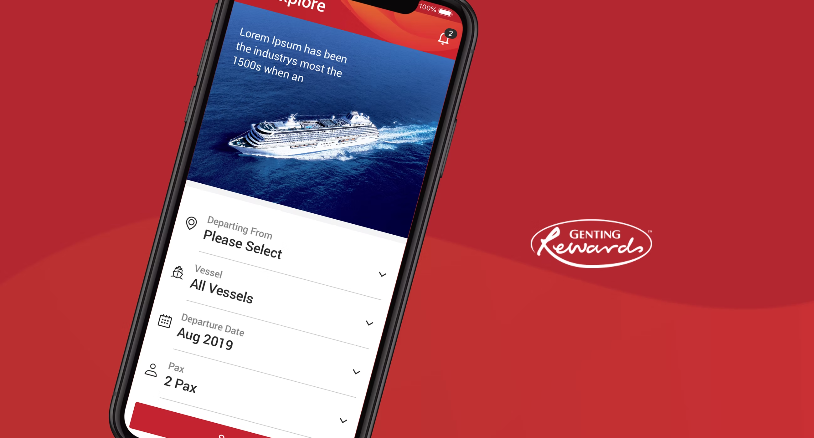
Genting Resorts Group engaged Cloud Interactive to redesign the Resorts World at Sea hybrid app — an all-in-one companion for passengers aboard their cruise ships. The existing app had accumulated usability debt: cluttered navigation, unclear booking flows, and no real accommodation for the core audience.

The target users were casino resort guests aged 45–65 and above, many of them not highly tech-fluent and travelling internationally. For this demographic, even a slightly confusing UI becomes a barrier to completing a booking or understanding their membership benefits.

Target Users
Casino resort guests, 45–65+
Core Problem
Poor usability for an older, less tech-fluent audience
Design Goal
Simplify bookings, rewards & wayfinding without losing depth
02 · UX Research — Stakeholder Interviews

Why stakeholder interviews — and not user interviews?

To protect the privacy of casino players, we could not recruit actual users. Instead, we designed a structured stakeholder interview programme — bringing together representatives from product management, marketing, and customer service, each of whom understood the audience from a distinct angle.

This approach let us triangulate pain points across perspectives, surface unspoken product expectations, and build a shared understanding of what "better" actually meant for this project.

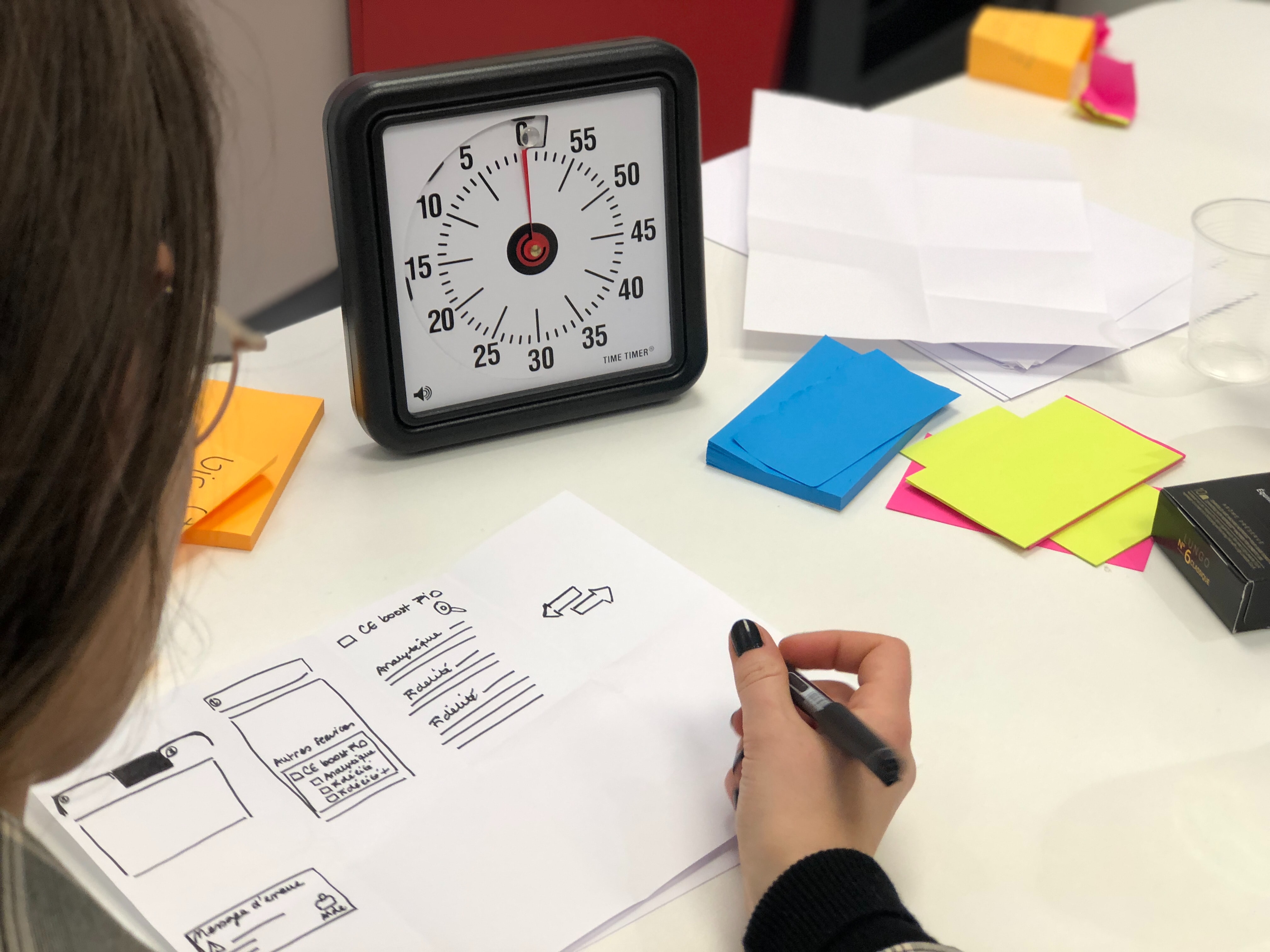
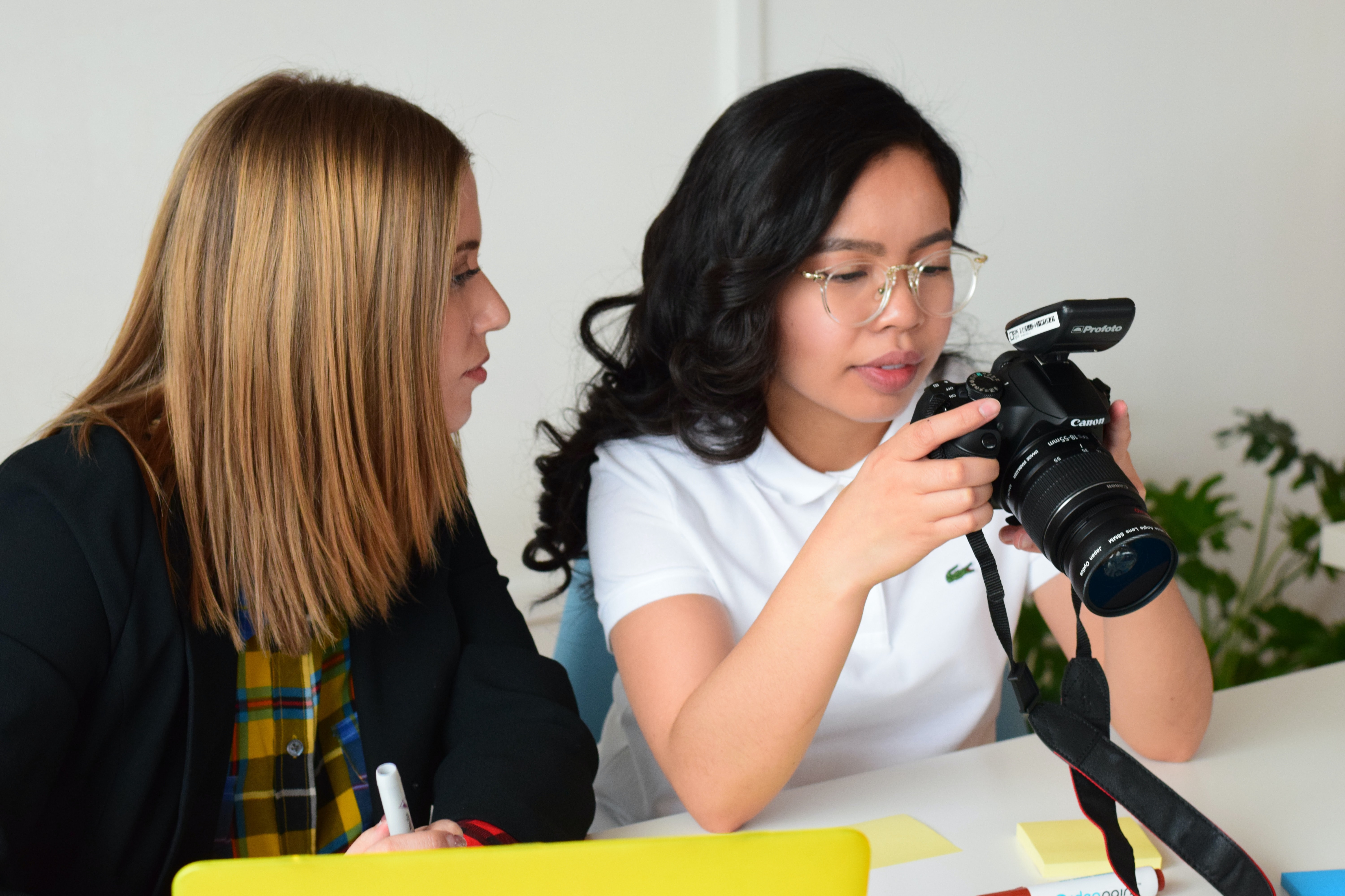
Interview preparation — in session
Interview preparation — session 1
Interview preparation — session 2
Interview preparation — session 3
1
Have a clear product goal
Involving key stakeholders from the outset ensures alignment on what success looks like — before a single question is written.
  • Establish mutual agreement on expected deliverables
  • Surface the primary issue that needs to be resolved through the project
2
Decide the participants
Rather than recruiting casino guests directly, we recruited stakeholder representatives who understand user preferences from different vantage points — product, marketing, and customer service.
  • Identify groups who can speak to user preferences and complaints (product managers, marketing team, customer service)
  • Arrange interview time slots that fit every key participant's schedule
3
Design interview questions
Questions are tailored per participant group — starting with rapport-building prompts and graduating to the core product problems.
  • Uncover pain points from previous product experiences
  • Prioritise severities — from the most critical issues to minor friction points
4
Conduct the interview
Before starting, we requested permission for voice recording and photography. Each session involved an interview conductor, a note-taker/photographer, and a recorder.
  • Choose environments where interviewees feel comfortable and at ease
  • Open with easy warm-up questions, then guide into follow-up depth
  • Stay fully present and follow a semi-structured format to allow pivoting
03 · Research Analysis

From raw notes to design direction

After the interviews, the team worked through two structured analysis steps to turn raw qualitative data into actionable design insights.

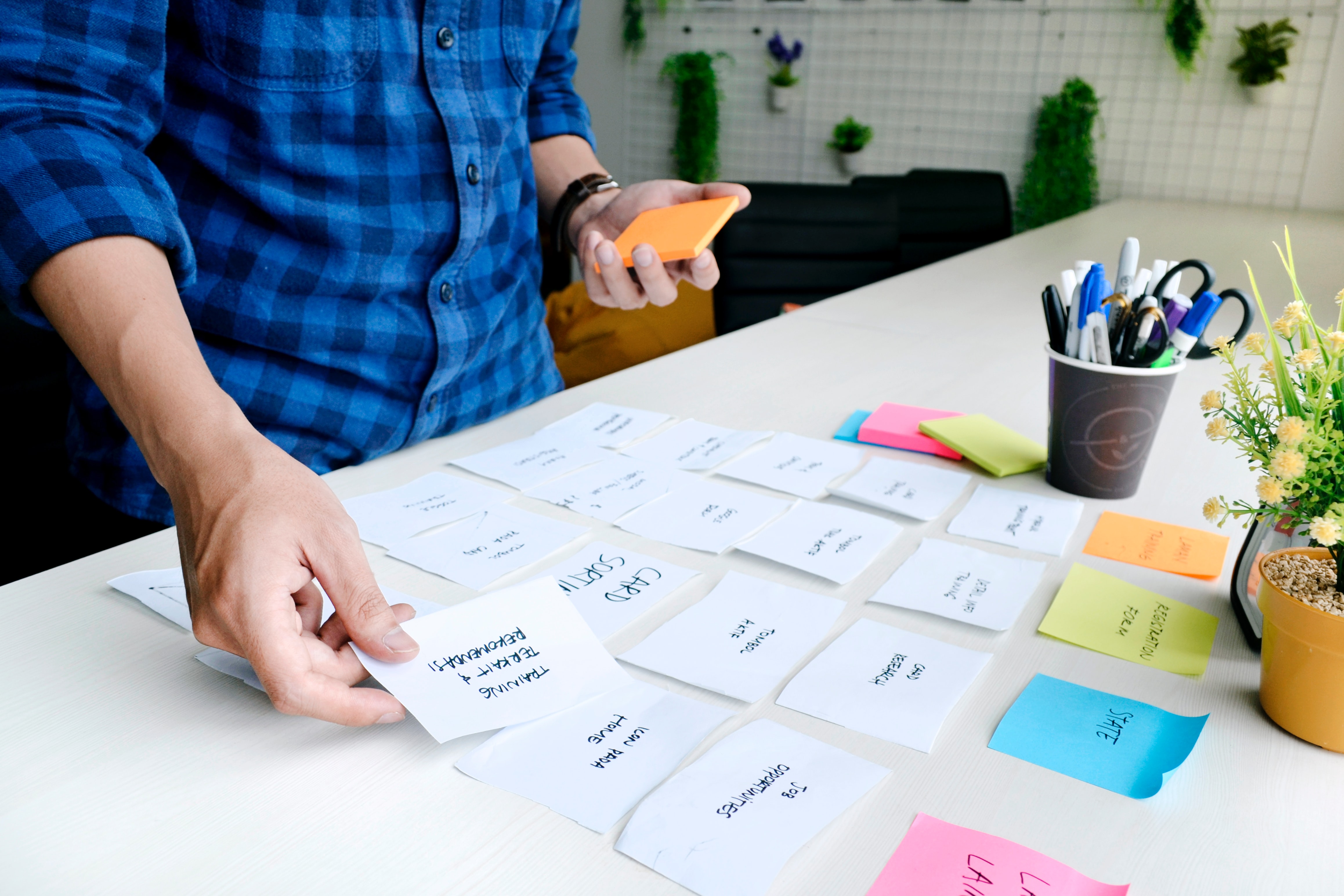
Step A Structure the information

To make qualitative data manageable, we organised notes, voice recordings, and personal impressions into structured formats. Using both written reports and visual mind maps, we could see patterns that were invisible in raw form.

  • Write structured research reports — anchored to the original goals and discussion guides
  • Build mind maps to visualise how pain points connect across participant groups
  • Sort all findings by user tasks and journey stages
Step B Synthesise design insights

With the data structured, we moved from describing problems to defining design direction — translating each recurring theme into a principle that could guide every subsequent decision.

  • Define clear pain points grounded in the collected data (not assumptions)
  • Identify potential improvements and enhancement opportunities in the experience
Interview analysis — affinity mapping & synthesis
Analysis — structured report
Analysis — mind map synthesis
Analysis — insight clustering
Research pipeline
Stakeholder
Interviews
Mind Map
Synthesis
Structured
Insight Reports
4 Design
Principles
Wireframes &
User Flows
04 · Design Insights

Four principles — every decision traced back here

Each insight emerged directly from what stakeholders described as their users' most pressing frustrations. These four principles became the design brief in everything but name — every screen, flow, and component was evaluated against them.

Action Guidance

Users should never feel lost — always knowing where they are, what they can do, and how to get to the next step.

  • Surface context cues that tell users their current location in the app
  • Proactively inform users how to complete an action successfully
  • Use consistent back navigation and progress indicators throughout
Booking with Flexibility

Booking flows must accommodate interruptions and reduce repetition — critical for an older audience with varied pacing.

  • Surface key tasks upfront — no buried menus or multi-tap navigation
  • Auto-save incomplete bookings so users can resume without starting over
  • Pre-fill frequently entered information to minimise retyping
Older Adults Friendly

The interface must feel effortless for users aged 45–65+ — prioritising physical ease, visual clarity, and cognitive simplicity.

  • Minimum 44px touch targets on all interactive elements
  • High-contrast text with generous line height and font size
  • Fewer decision points per screen — shorter, clearer journey maps
  • Plain language CTAs — no jargon, no ambiguity
Tailored Information

Members should never have to search for the value of their membership — benefits, points, and history should surface naturally.

  • Make member benefits and perks immediately visible on arrival
  • Show reward points balance and how to earn more — always at hand
  • Traceable booking history so users can review and refer back easily
05 · Wireframes & User Flows

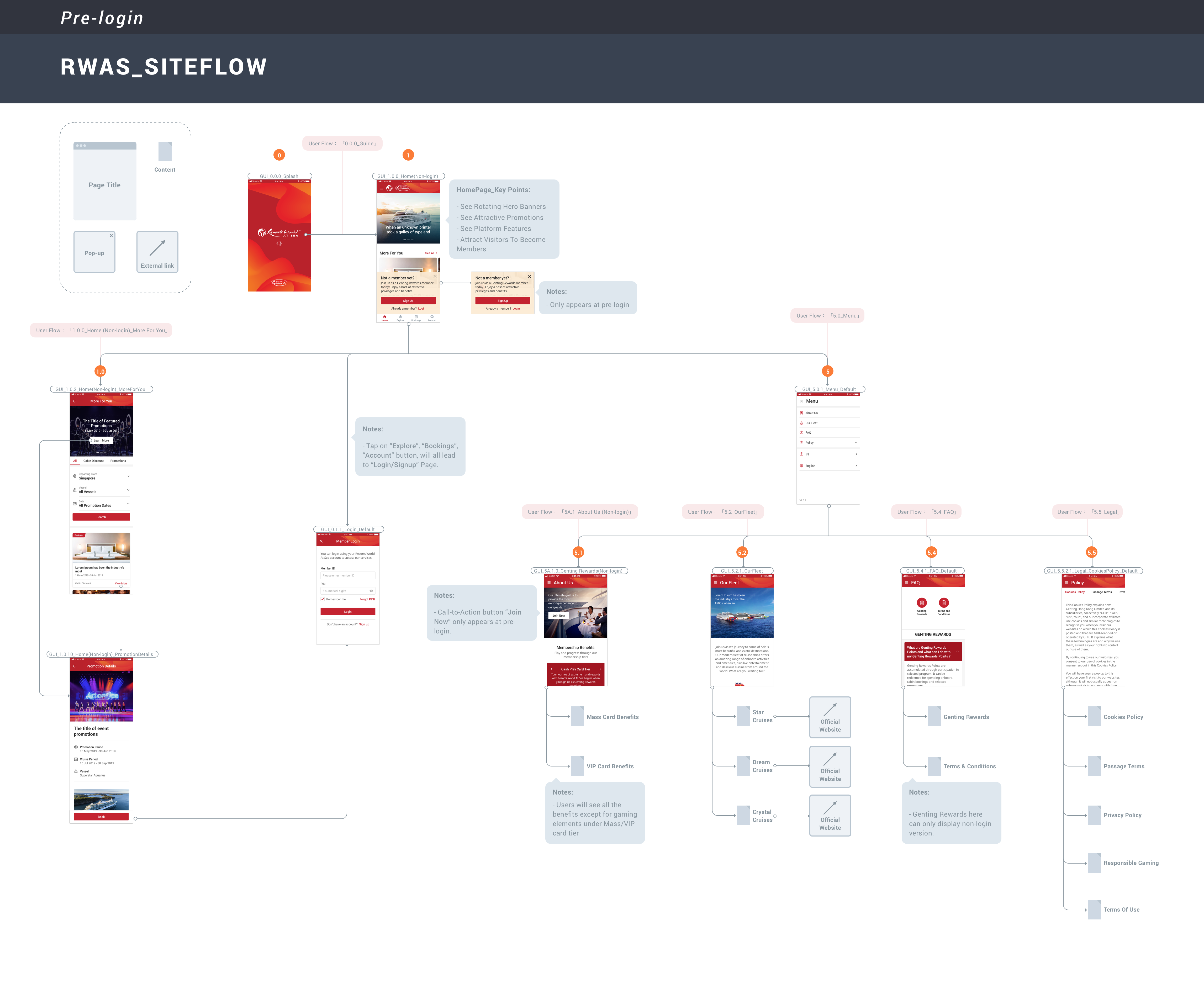
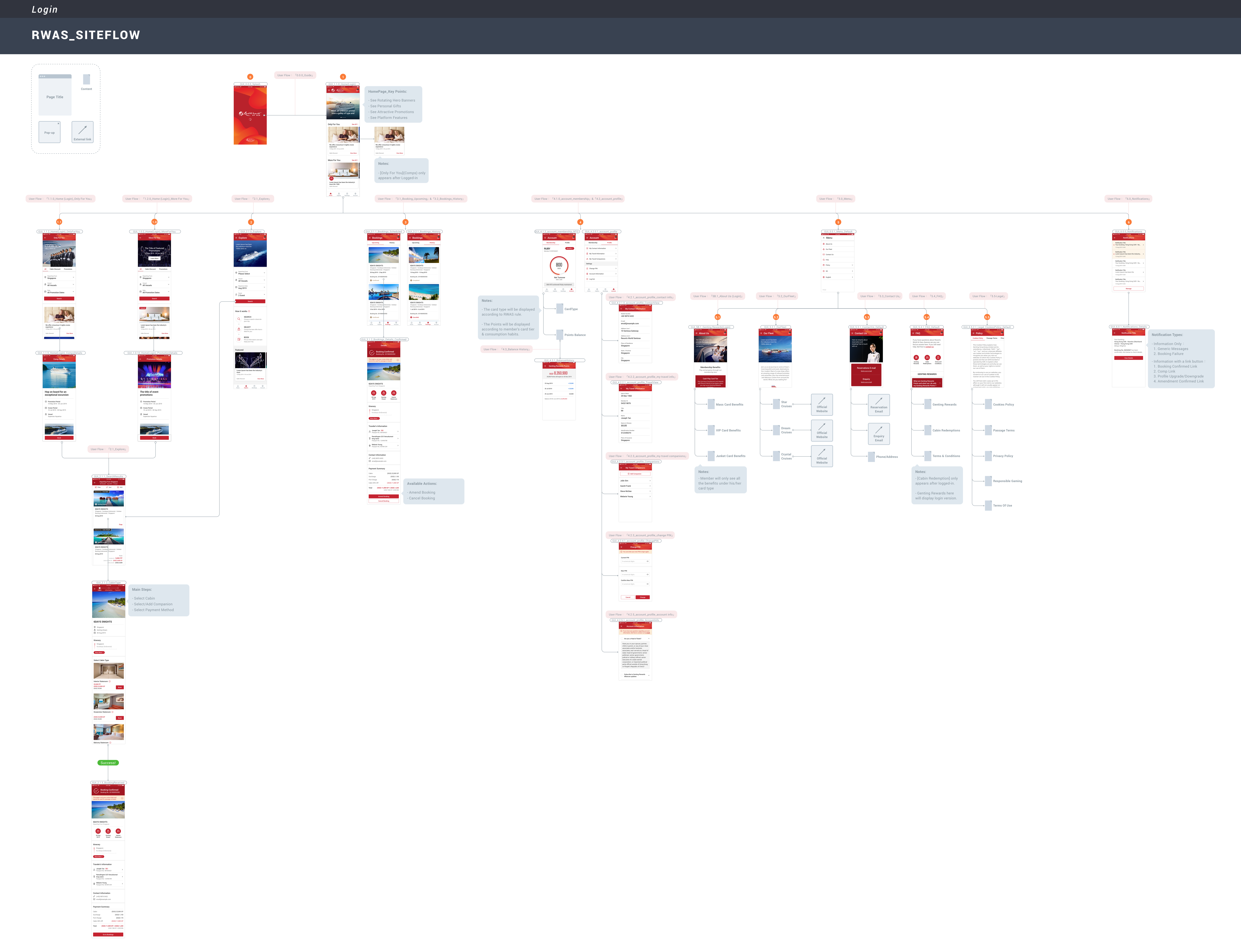
Site map & screen architecture

Wireframes were produced for both desktop and mobile — covering two key access states: non-logged-in (discovery & browsing) and logged-in (personalised member experience). Each state reflects a distinct user goal and information hierarchy shaped directly by the four design principles.
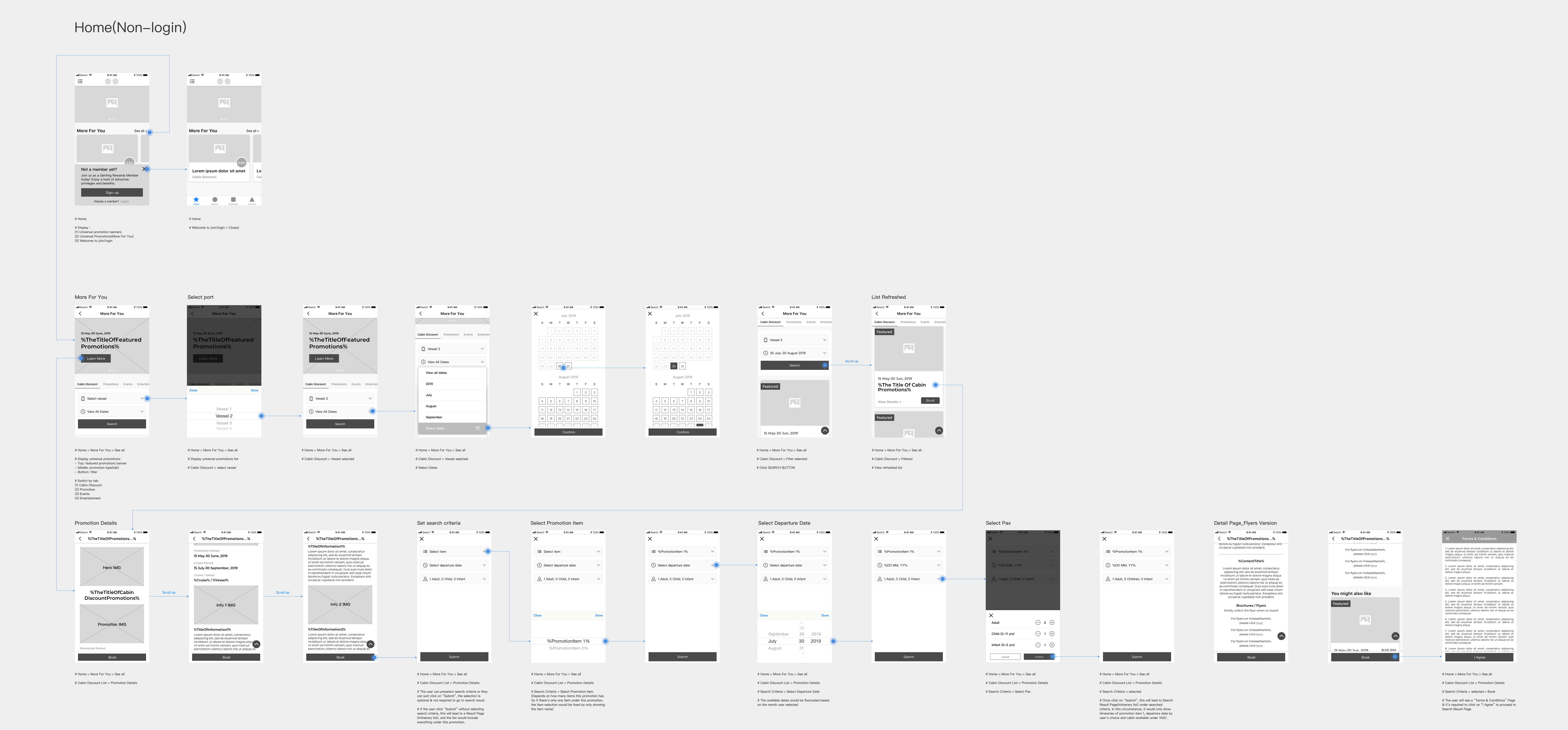
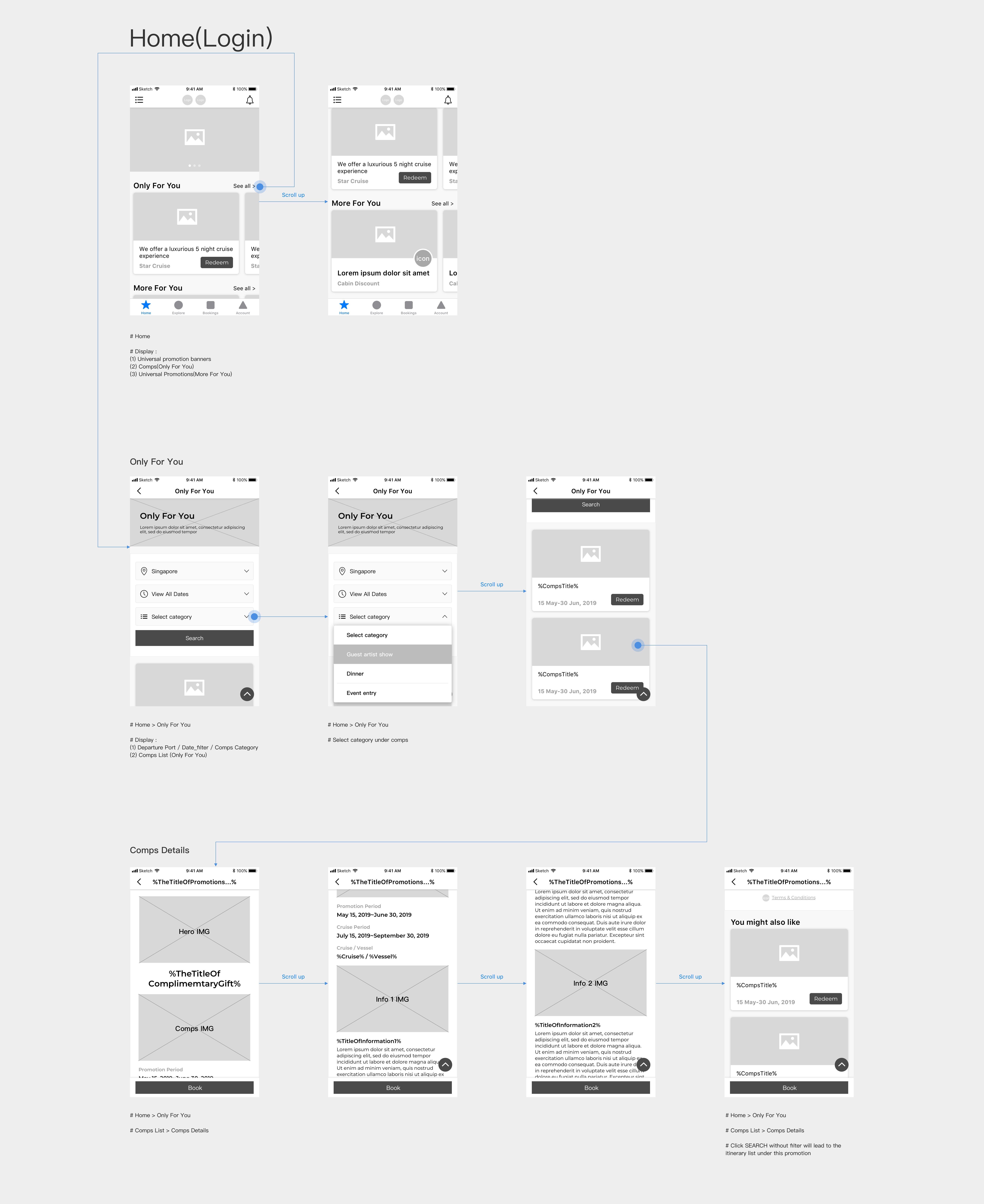
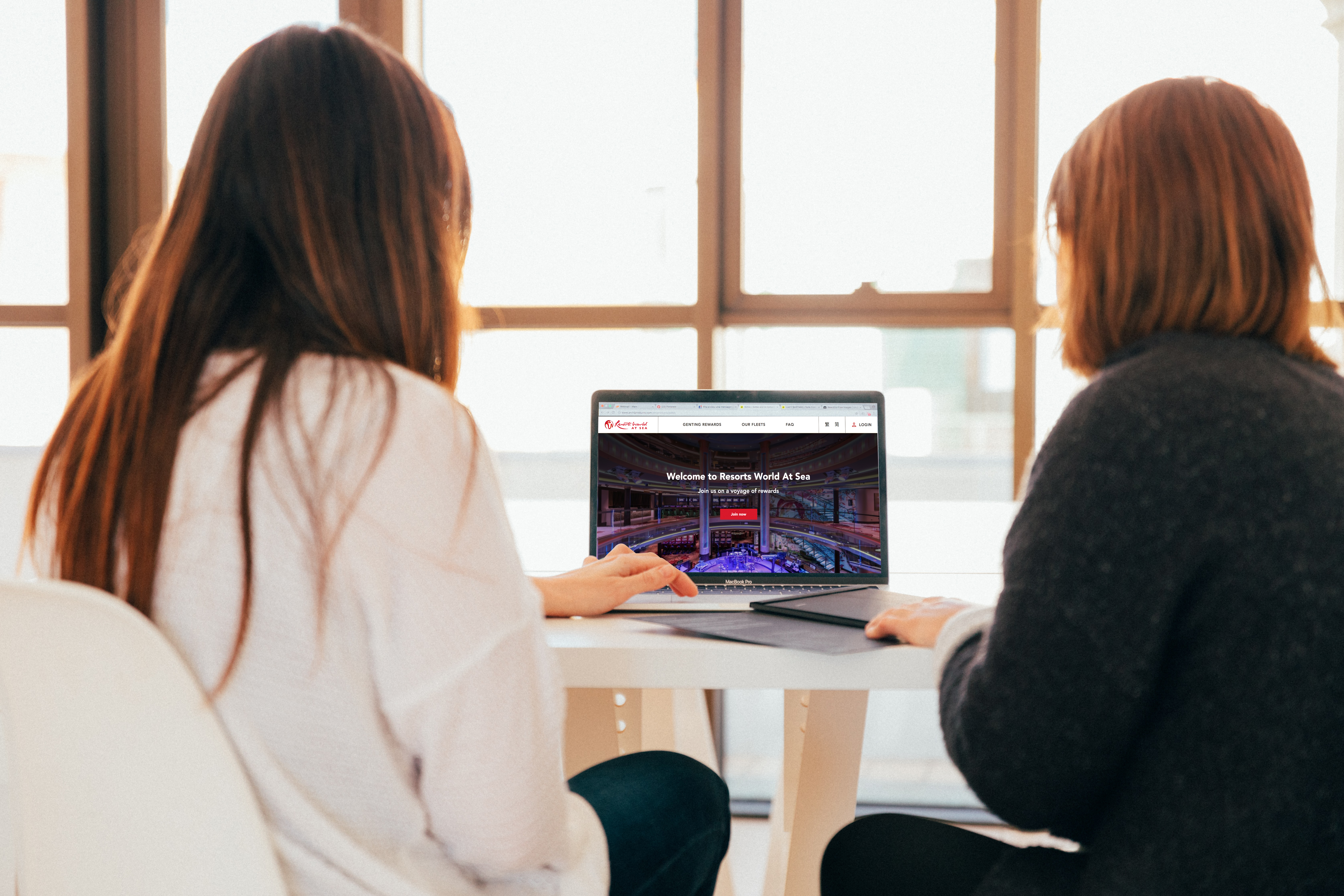
Desktop — Non-login state
Homepage wireframe — Desktop, non-login state
Desktop — Logged-in state
Homepage wireframe — Desktop, logged-in member state
Mobile — Non-login & logged-in states
Mobile wireframe — non-login state
Mobile wireframe — logged-in member state

Left: anonymous visitor view  ·  Right: authenticated member view with personalised rewards & booking history
Hybrid App UX Research Stakeholder Interviews Accessibility Older Adult UX Hospitality Singapore
Next project
Int-Learn
View case study