FinTech · Mobile App · Family
Fubon Family Finance App
A dual-audience gamified finance app — teaching kids to save through missions and wish lists, while giving parents full oversight and control
A dual-audience gamified finance app — teaching kids to save through missions and wish lists, while giving parents full oversight and control
Fubon Finance commissioned a financial education app for children aged 4–12 — a category that barely existed in Taiwan at the time. The challenge wasn't just building something "for kids." It was building a product that served two completely different audiences simultaneously: children who needed delight, game mechanics, and age-appropriate complexity; and parents who needed confidence, control, and transparency.
A purely child-facing app would fail parents. A purely parent-facing one would bore children instantly. The design had to hold both — feeling like a game to a 7-year-old and a financial dashboard to their parent, all within the same product.
The app operates as a shared ecosystem where both users are active but playing entirely different roles. Understanding what each user type actually wanted — not just what the client assumed they wanted — was foundational to every design decision.


Understanding motivations — not just tasks — is what separates a product people use from one people enjoy. Both audiences needed a reason to return daily, but those reasons are fundamentally different.
Parents are motivated by long-term outcome — they open the app to see progress, assign new challenges, and feel confident that their child is developing healthy financial habits. The social sharing element also lets them connect with other parents navigating the same journey.
Children are motivated by immediate feedback and visible progress toward something they care about. Five distinct motivation levers were identified:
The product logic is organised around three core value streams — each addressing a different layer of the family finance experience. They are designed to reinforce each other: completing tasks earns points, points build savings, and savings connect to real goals on the wish list.
Turns everyday responsibilities into a reward loop — linking behaviour to learning outcomes.
Connects parent and child accounts into one transparent savings ecosystem.
A community layer that keeps parents engaged and learning alongside their children.
The reward loop is intentionally short for younger children (visual, instant) and progressively longer for older children (goal-oriented, delayed). This mirrors how different age groups build habits — instant gratification at 5, deferred reward at 11.
Every design decision in these three screens was traced back to the motivations and mental models of each user group — not feature completeness.
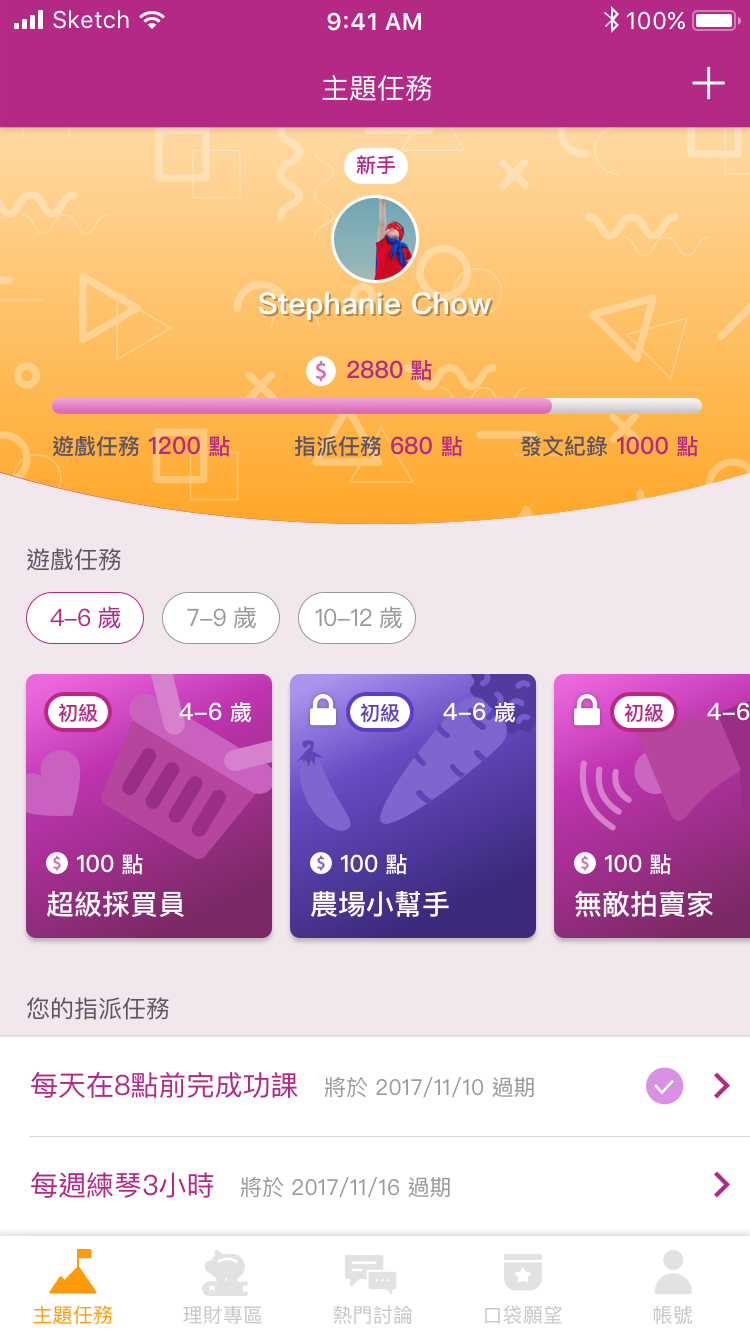
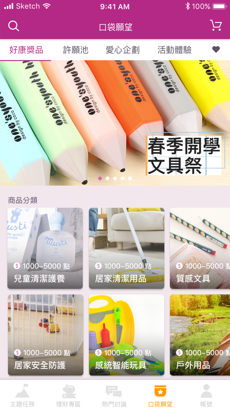
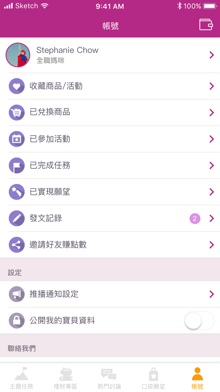
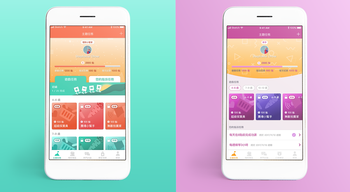
Two complete visual identities were developed — same UX structure, different emotional register. Parents could choose the theme that matched their child's personality, increasing ownership and daily engagement.
"The overall style and colour conveys a vibrant, positive energy. The goal is to let both kids and parents feel hopeful and energised when using the app." Purple communicates imagination and creativity — ideal for children who lean toward fantasy and adventure themes.
"Statistics show kids are drawn to colours as bright as sunlight or sunset rays. Orange carries warmth and positive energy, and paired with green, together they send out a natural, grounded vibe." Orange Bloom is designed for children who respond to warmth, energy, and the outdoors.
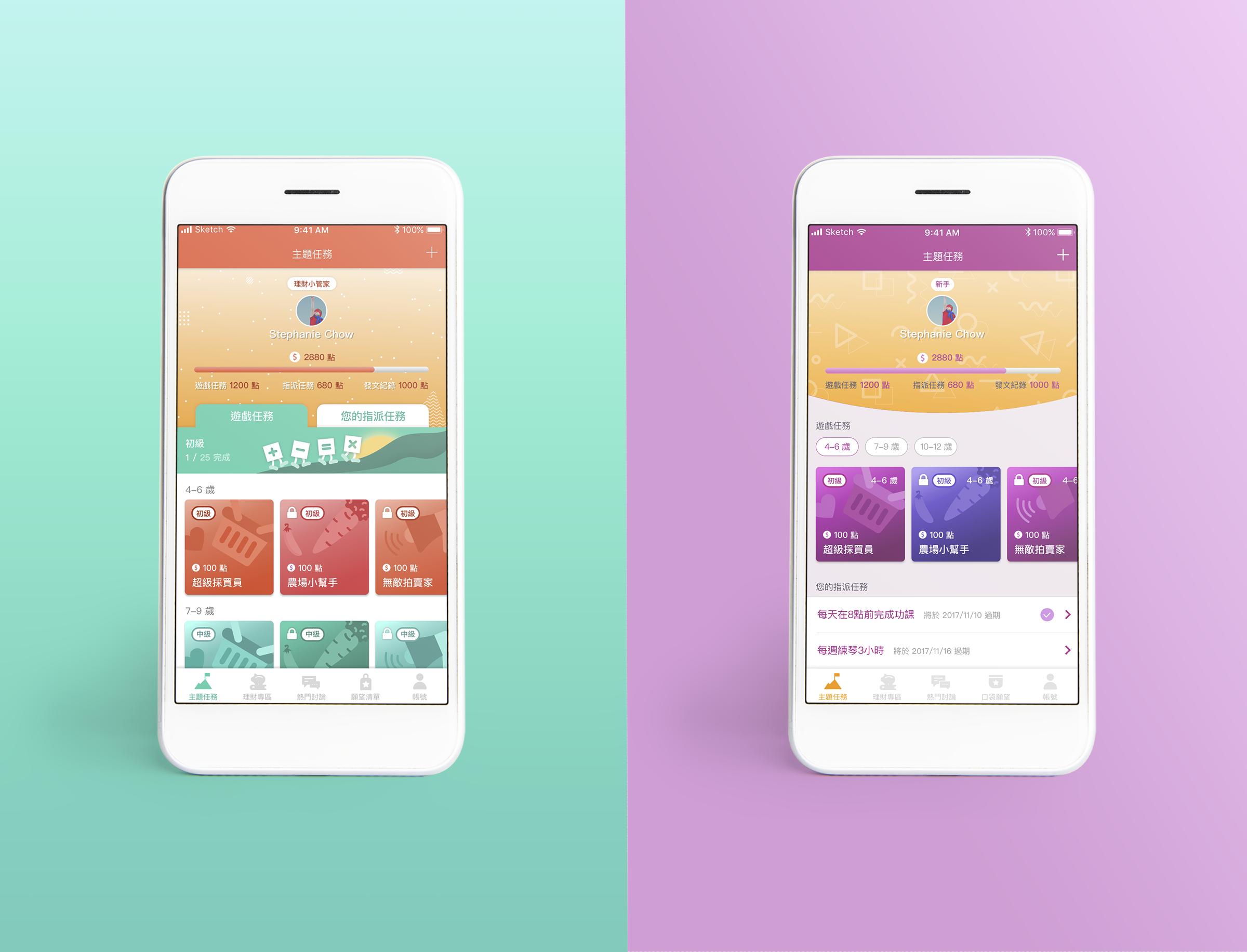
Complete interface design across child-facing and parent-facing screens — Purple Shade style
