01 · Project Overview
Fitbit, reimagined for the whole family
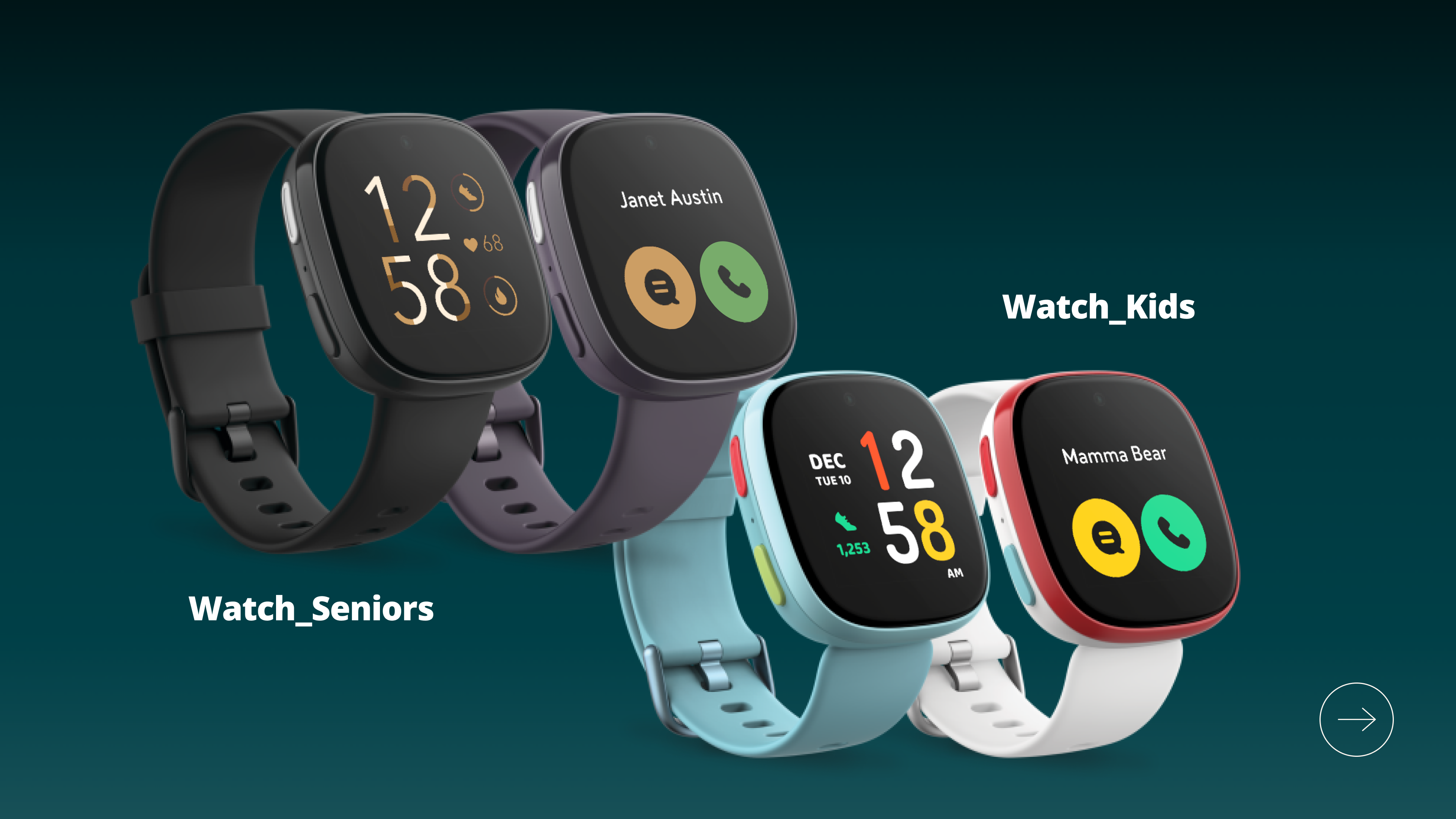
Fitbit's existing product line is built for the individual — one user, one device, one fitness journey. This concept project challenges that model. Fitbit Connect reframes the wearable as a family safety and connection layer: a way for parents to stay close to their children, for adult children to care for aging parents, and for seniors and kids to feel secure and reachable — without needing to navigate a smartphone.
The project tackled an unusual design brief: three fundamentally different user groups, two distinct hardware form factors, and one coherent product ecosystem — all designed remotely between Taipei and San Francisco over 14 months.
Users
3 generations, 3 distinct mental models
Platforms
Smartwatch (2 variants) + companion app
Collaboration
Remote — Taipei × San Francisco
Kay's contribution
5-designer team: 2 UX designers from Hong Kong handling the companion app; 1 designer on the seniors watch UX; 1 designer on seniors watch UI. I owned UX/UI design for the kids watch and UI design for the parent companion app. Fitbit's principal designer served as the key stakeholder across all iterations, with responsibilities covering user testing, user analysis, wireframes, user flows, and UI mockups.
02 · Research & Insights
Before a single screen was drawn
The design process was grounded in evidence, not assumptions. User testing and analysis ran before any concept direction was set — informing not just features, but fundamental product positioning. The question wasn't "what can a smartwatch do?" but "what do these families actually need from a connected device?"
Design process
User Testing
User Analysis
UX Strategy
Concept Design
Family Connection
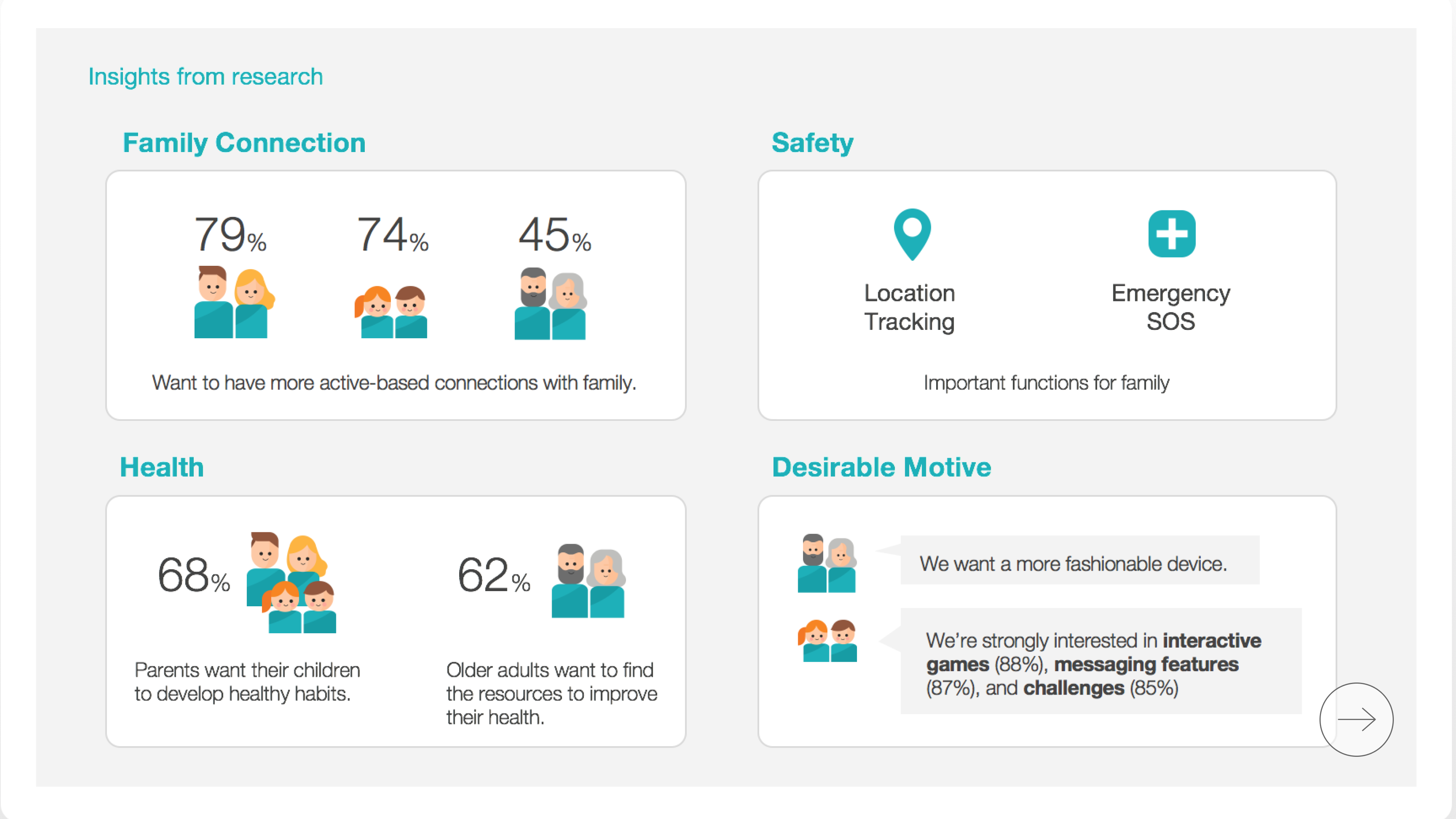
Most users across all groups wanted more active, tech-mediated ways to stay connected to family — not just passive visibility.
- 79% / 74% / 45% across groups wanted more active-based family connections
- Passive check-ins were not enough — people wanted to feel present
Safety as Core Value
Location tracking and Emergency SOS were identified as the highest-priority functions across all family roles — non-negotiable features, not nice-to-haves.
- Location tracking — peace of mind for parents & adult children
- Emergency SOS — critical for kids and seniors in unfamiliar situations
Health Motivation
Health means something different to each generation — but it's universally present as a motivation for using a wearable.
- 68% of parents want their children to develop healthy habits early
- 62% of older adults want technology to help them understand and improve their health
Emotional Needs, Not Just Features
Both kids and seniors had clear emotional needs beyond utility — designing only for function would miss the real drivers of adoption.
- Kids: interactive games (88%), messaging features (87%), challenges (85%)
- Seniors: "We want a more fashionable device" — not a medical tool
03 · Three Target Users
One ecosystem. Three distinct experiences.
Each user group has a different relationship with technology, a different emotional need, and a completely different interaction model. The product had to serve all three simultaneously — without one group's experience compromising another's.
Watch
Kids
Ages 8–11 · Watch user
Primary needStay connected to family in a fun, safe way
- Video call & message family contacts
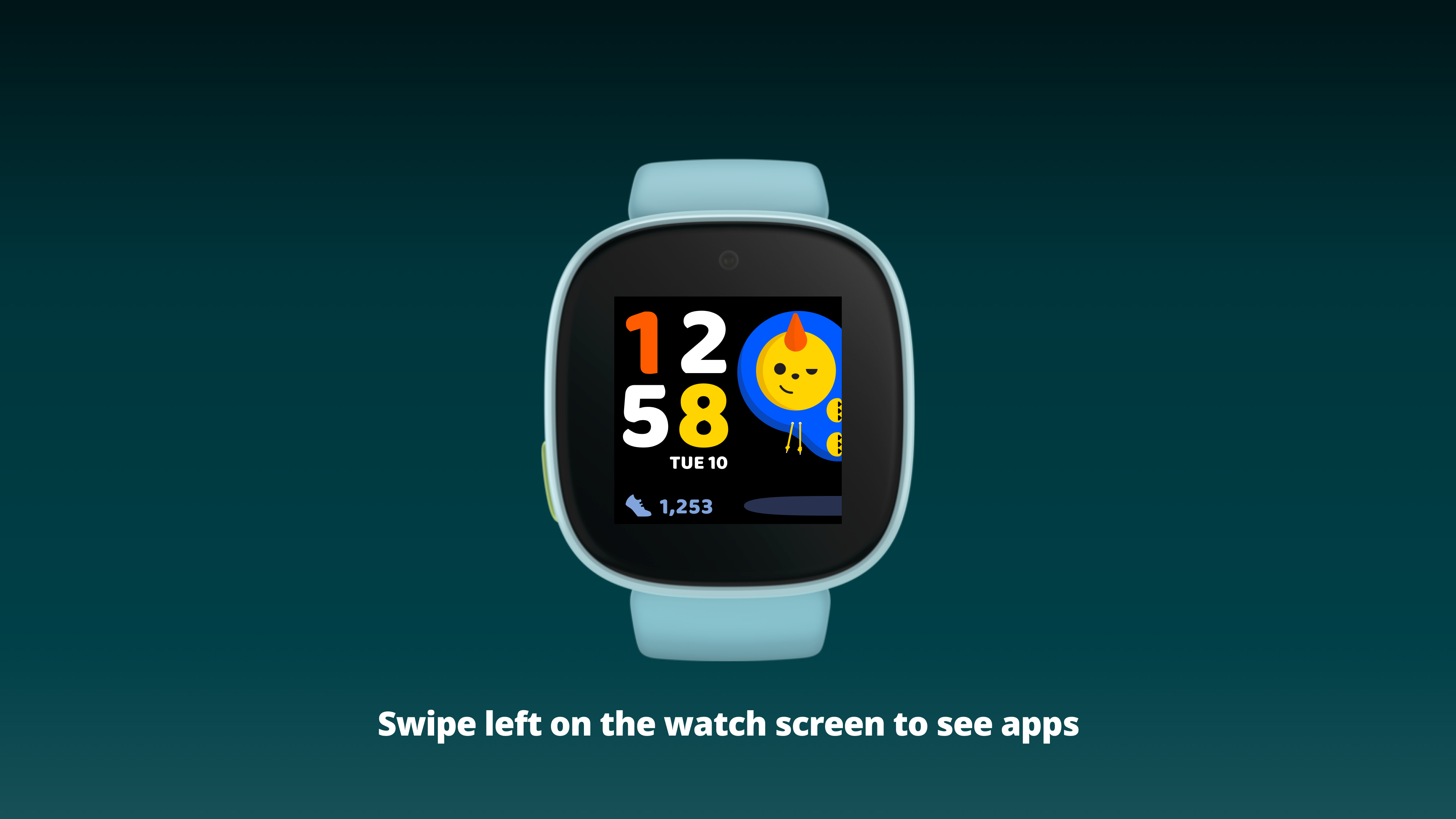
- Explore app carousel: call, message, to-do, alarms, timer, location
- Playful clock face with mascot character & step count
- All contacts pre-approved by parents — no unknown callers
Watch
Seniors
Ages 65–85 · Watch user
Primary needStay independent, healthy, and reachable
- Clear, high-contrast clock face & prominent contact display
- Health stats at a glance: steps, sleep time, heart rate
- Emergency SOS accessible from any screen via physical button
- Conventional icons — no abstract metaphors or learning curve
App
Parents
Adults · Companion app user
Primary needMonitor, protect, and stay in touch with family
- View real-time location of kids & seniors on map
- Receive alerts: safe-zone exits, Emergency SOS triggers
- Initiate calls & messages to watch wearers from the app
- Manage approved contacts & family settings for each watch
04 · Design Principles
Tailored interaction models for each generation
The same UI conventions that make a design clear to an adult can make it inaccessible to a child — or alienating to a senior. Each user group required its own design grammar, derived directly from how that group perceives and interacts with digital interfaces.
For Kids — Ages 8–11
Storytelling
Characters & Narrative
A mascot character on the clock face gives kids something to identify with — making the watch feel personal, not functional. Characters respond to interactions with animation, rewarding every use.
Instant Effects
Immediate Visual Feedback
Children cannot tolerate delay between action and response. Every tap triggers an immediate visual or sound reaction. Loading states are animated — there is never an empty, unresponsive moment.
Colors & Patterns
Icons as Primary Language
Children identify objects by color and shape before text. Each app in the carousel is a distinct color + icon — text labels are supplementary. The icon IS the affordance. No ambiguity about which app is which.
Safety
Curated, Gated Feature Set
The kids watch exposes only what children need. Every communication feature — calls, messages — is locked to parent-approved contacts. No open internet, no unknown senders, no accidental exposure.
For Seniors — Ages 65–85
Familiarity
Conventional Interaction Elements
Seniors find it difficult to decode abstract or novel icon styles. Every icon uses widely recognized symbols — avoiding metaphor-dependent visuals that require prior digital literacy to interpret.
Accessibility
Easy-to-Target Buttons
Larger type, high-contrast color blocks as buttons, and generous tap targets. The interface communicates at a glance what is interactive and what is static — reducing hesitation and accidental inputs.
Clarity
Clear Feedback on Every Action
After every interaction, a visible state change confirms what happened. Seniors need to feel in control — uncertain or ambiguous states create anxiety and avoidance of the device entirely.
Safety
Emergency Always Within Reach
Quick Settings — accessible by holding the physical side button for 2 seconds from any screen — means Emergency SOS is never more than one action away, regardless of where the senior is in the interface.
05 · UX Architecture
A navigation model built around the wrist
The watch's spatial navigation was designed to feel physical and predictable — matching how people intuitively expect a wrist device to respond. The clock face is always the anchor. Every surface is reachable within one to two gestures, and every gesture maps to a consistent spatial direction.
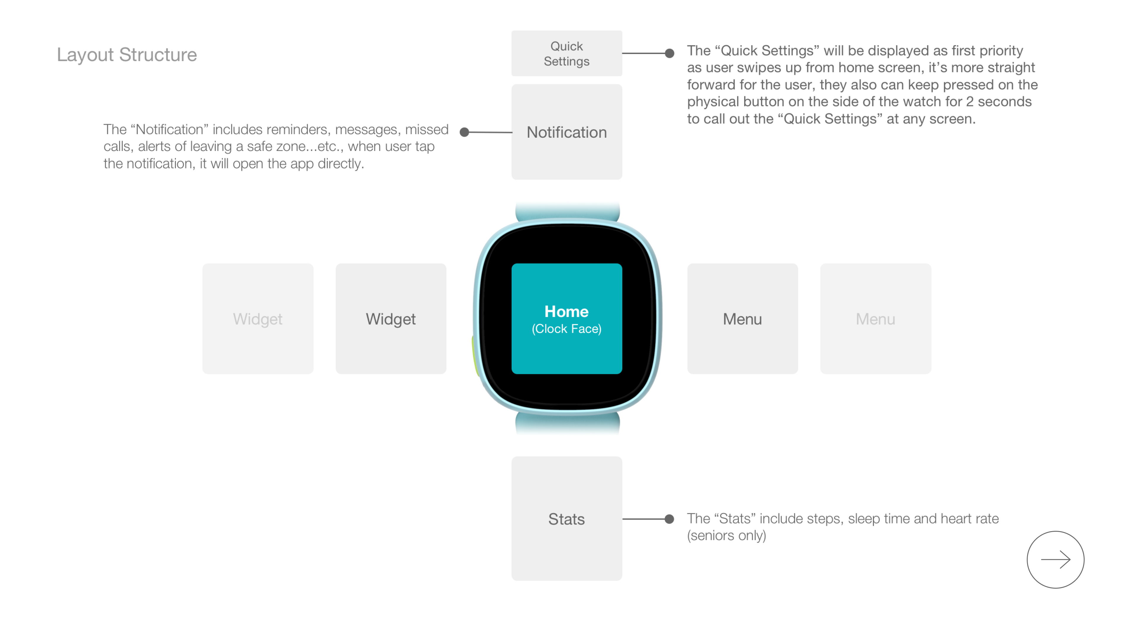
Swipe Up → Quick Settings
The most critical functions — brightness, DND, Emergency SOS — are always one swipe from home. Also triggerable by holding the physical button for 2 seconds, from any screen.
Swipe Down → Notifications
Reminders, messages, missed calls, and safe-zone alerts. Tapping a notification opens the source app directly — no hunting through menus.
Swipe Left → App Carousel
The full app menu accessed as a horizontal swipe carousel — each app a distinct color circle. Swipe to browse, tap to enter. The last app (Tips) serves as a built-in wayfinding anchor.
Swipe Down (Home) → Stats
Steps, sleep time, and heart rate — available immediately without entering an app. Health at a glance, particularly important for the seniors watch experience.
Physical button = universal safety net
Pressing the physical side button always navigates back to the clock face — a predictable, muscle-memory exit that works even if a user gets disoriented inside an app. For seniors especially, this single interaction provides a consistent "home" regardless of how lost they might feel on screen.
06 · Feature Demo — Kids Watch
How a child makes a video call
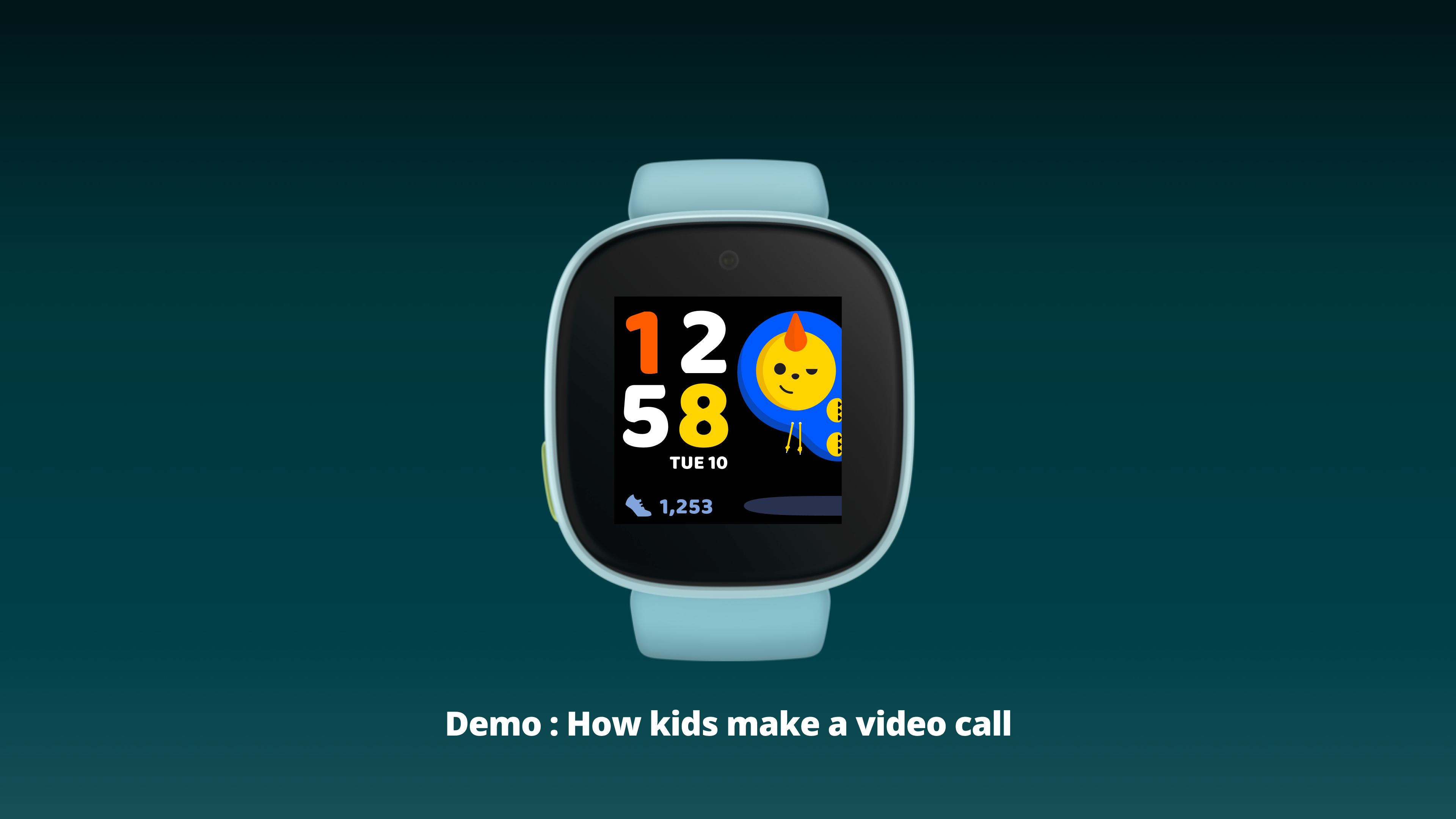
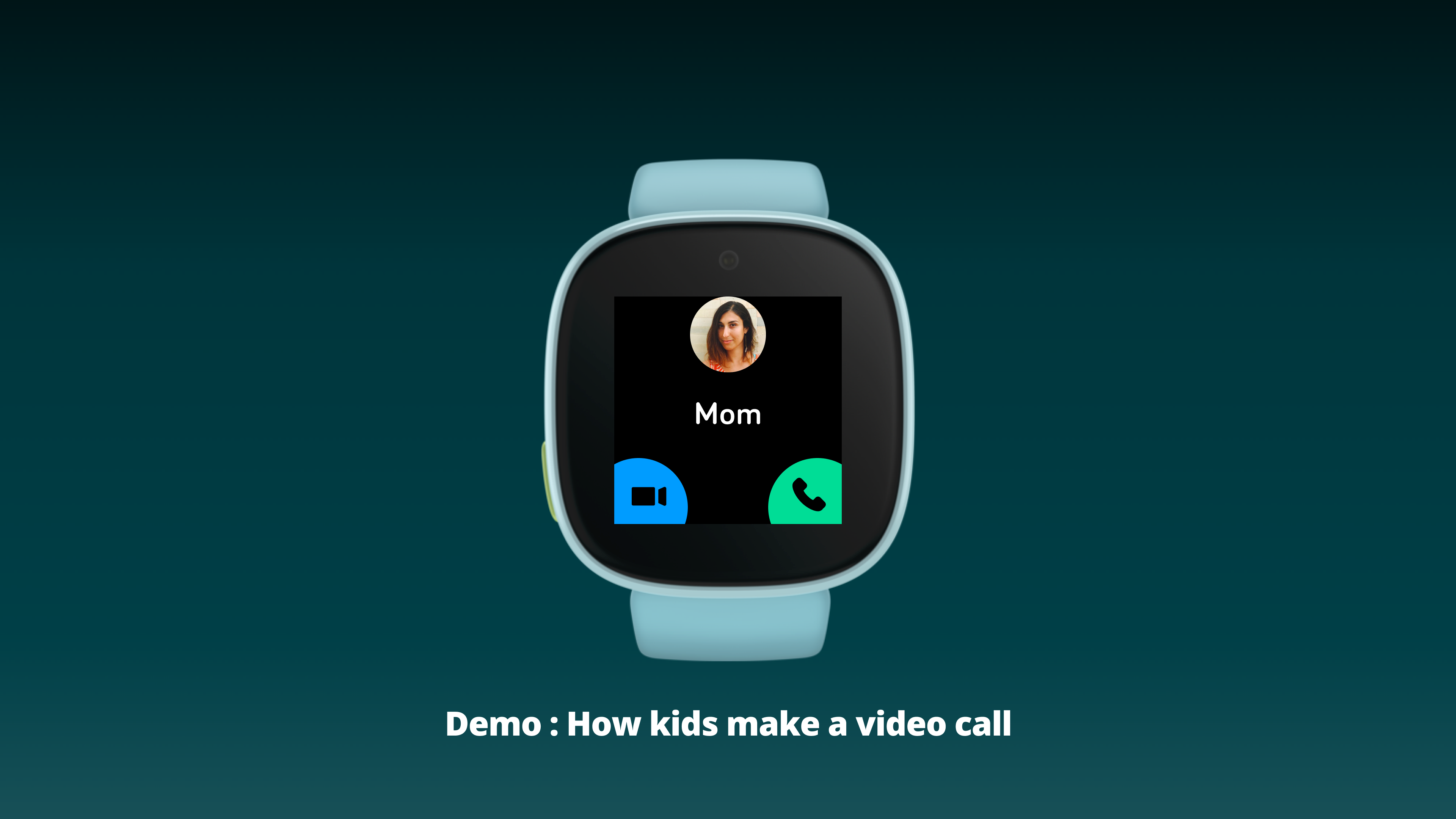
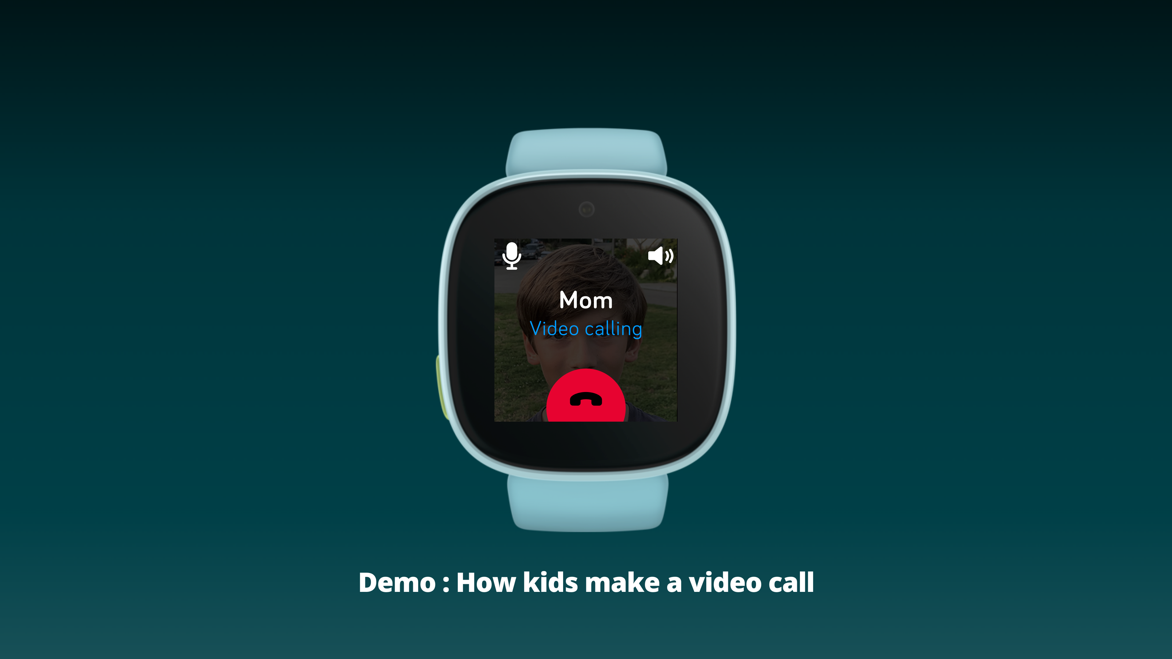
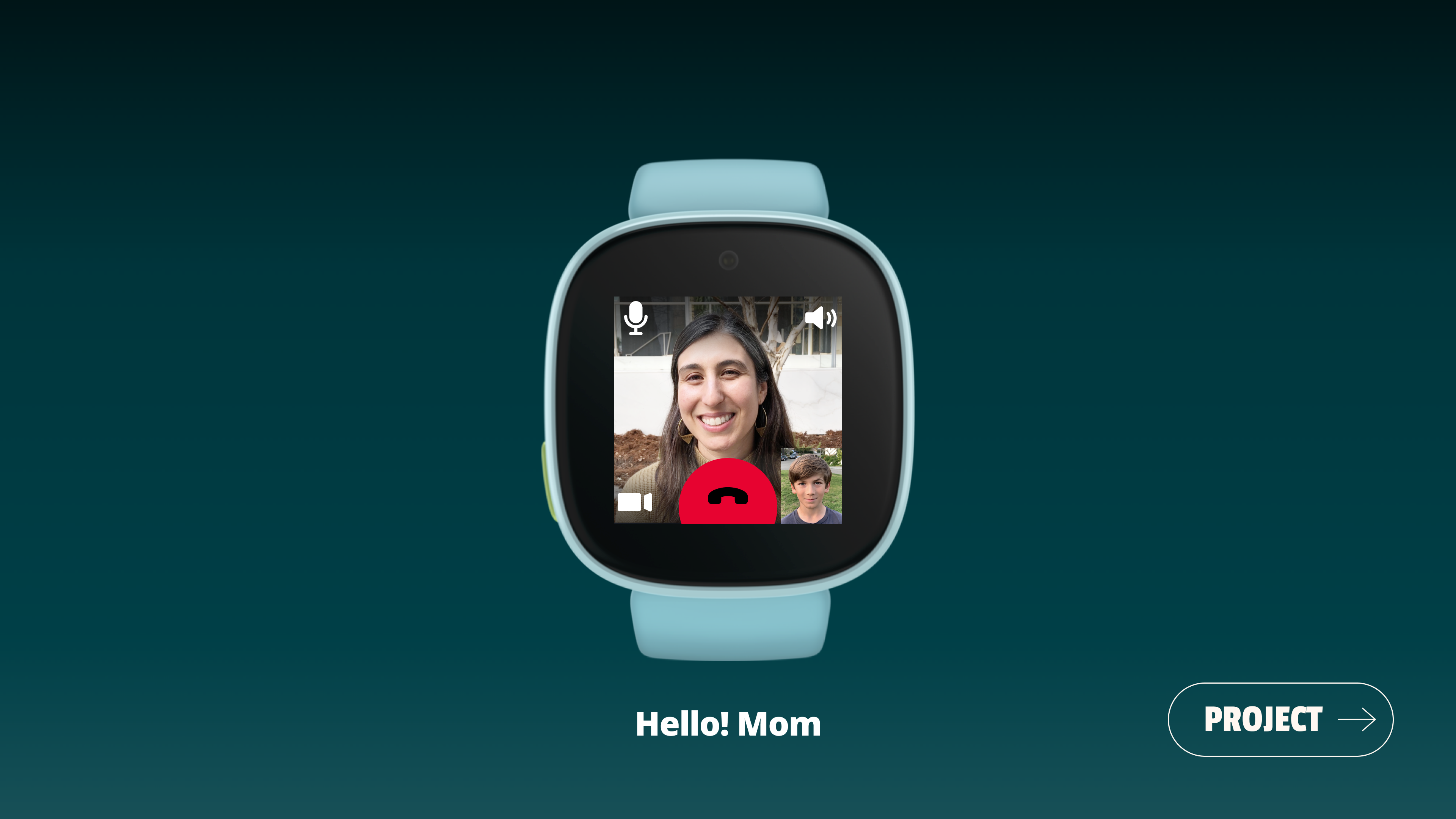
The video call flow is the primary connectivity feature of the kids watch. The design challenge: make it simple enough for an 8-year-old to use independently — while keeping the contact list locked to family-approved people only. No searching, no typing, no risk of calling a stranger.
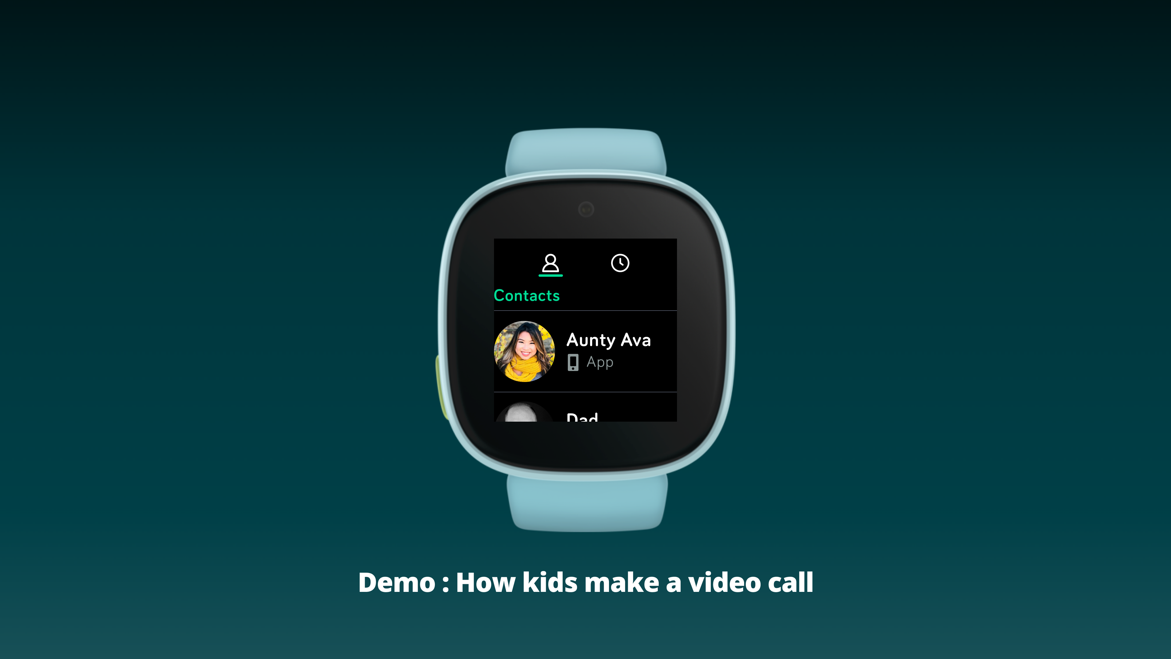
The complete flow from clock face to connected call takes just 4 taps. Every step uses large, color-coded affordances. There is no ambiguity about what to press next.
Full flow — clock face to connected video call
- Contacts list is locked to parent-approved family members — no unknown callers possible, ever
- Each contact shows which device they're reachable on (phone icon = App), so kids know before calling
- Video and voice call are equal-weight options — neither is buried or treated as secondary
- Live call screen: caller's face full-screen, child's selfie in corner, mic & speaker icons at top, large red hang-up as the only persistent action
07 · App Ecosystem
Eight apps. Eight colors. Zero confusion.
The kids watch app carousel is a deliberately curated set — not a minimal set, but a carefully scoped one. Every app has a unique color and icon combination navigable by swiping left from the clock face. The color system is the navigation system: children learn to recognize "the green one" as Call before they can reliably read a label.
Call
Video & voice calls to approved family contacts
Kids + Seniors
Message
Quick messages to family members on the companion app
Kids
To Do
Task list — parents assign, kids complete to build daily habits
Kids
Alarms
Set reminders for school, meals, and daily activities
Kids + Seniors
Timer
Countdown timer for homework, playtime, and chores
Kids
Location
Share live location with parents — always-on safety layer
Kids + Seniors
Settings
Display brightness, sound, and connection preferences
Kids + Seniors
Tips
Watch usage guidance — always the last app in the carousel
Kids
Why Tips is last — a deliberate navigation decision
Tips is intentionally placed as the final app in the swipe carousel. It acts as a built-in wayfinding anchor: if a child swipes all the way through without finding what they need, Tips is there as a fallback. It also signals a clear end to the carousel — preventing the anxiety of infinite scrolling without a sense of completion.