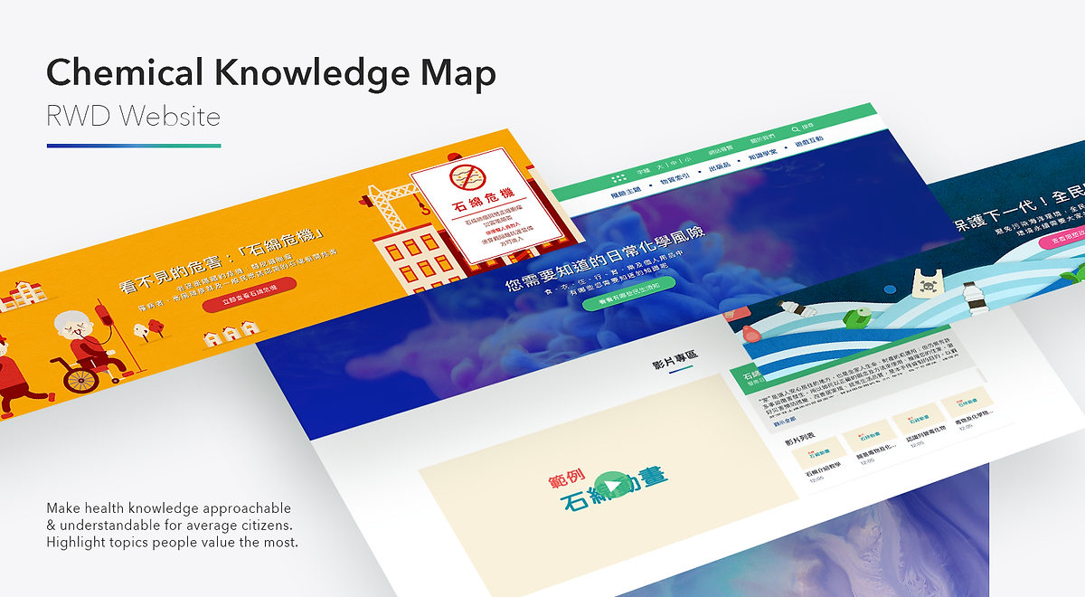
01 · Context
Dense government data. Zero public engagement.
Taiwan's Toxic & Chemical Substances Bureau had a public safety problem: how do you help ordinary citizens understand which chemicals in their daily lives are hazardous — and why? The existing resources were thick reference documents written for regulatory professionals. Nobody read them. Nobody was supposed to.
The subject matter is inherently technical and potentially alarming. The design challenge was to make it approachable — even enjoyable — without trivialising the safety message. Government sites have a reputation for being unusable. This was a chance to prove that public service design can be world-class.
Starting Point
Dense regulatory documents nobody reads
Audience
General public — zero chemistry background assumed
Full Scope
UX + UI + illustration system + 200+ icon entries
02 · The UX Problem
The taxonomy mismatch — experts vs. real people
The core design problem wasn't visual — it was structural. Chemical databases are organised the way chemists think: by compound name, molecular formula, CAS number. But the people this site needed to reach don't think in chemical terminology. They think in terms of their daily lives.
A parent worrying about their child's plastic water bottle doesn't search "Bisphenol A." They think about what their child is drinking from. This mental model gap was the central design challenge: the information had to be reorganised around how citizens actually encounter chemicals — not how scientists classify them.
The strategic pivot
Instead of asking "what chemical are you looking for?" — which requires prior knowledge — we asked "where in your life did you encounter it?" This single structural decision unlocked the entire information architecture.
04 · Information Architecture
Five categories. Five worlds citizens already live in.
The top-level navigation is built entirely around daily life contexts. Each category represents a recognisable domain — the kitchen, the closet, the commute. Within each, chemicals are surfaced through the objects and situations that people already encounter. The user never needs to know a chemical name to start exploring.
Food
Preservatives, additives, packaging
Cloth
Dyes, fabric treatments, synthetic fibres
Accommodation
Cleaning agents, paints, plastics
Traffic
Fuels, exhaust, road materials
Education & Entertainment
Art supplies, toys, electronics
Why this works
A user worried about a cleaning product doesn't need to know it's called "sodium hypochlorite" — they navigate to Accommodation → Cleaning → and encounter it in its real-world form first, before any chemical name appears. Understanding comes before jargon.
05 · Feature Design
Three layers of discovery — browse, search, explore
Different users approach the same content with different behaviours. A curious teenager browses visually. A concerned parent searches by object. A student doing research explores connections. The design supports all three simultaneously — without forcing any single mental model onto the experience.
Browse by Category
Visual-first entry through life context cards. No prior knowledge required — users choose the world they recognise and explore from there.
Search by Keyword
Type a product, object, or chemical name. Results are icon-first, colour-coded by category — visual recognition before reading.
Knowledge Map
An interactive visual map reveals connections between everyday items and compound families. Gamified — chemicals "unlock" as users explore adjacent categories.
Illustration System — Making Chemistry Feel Safe
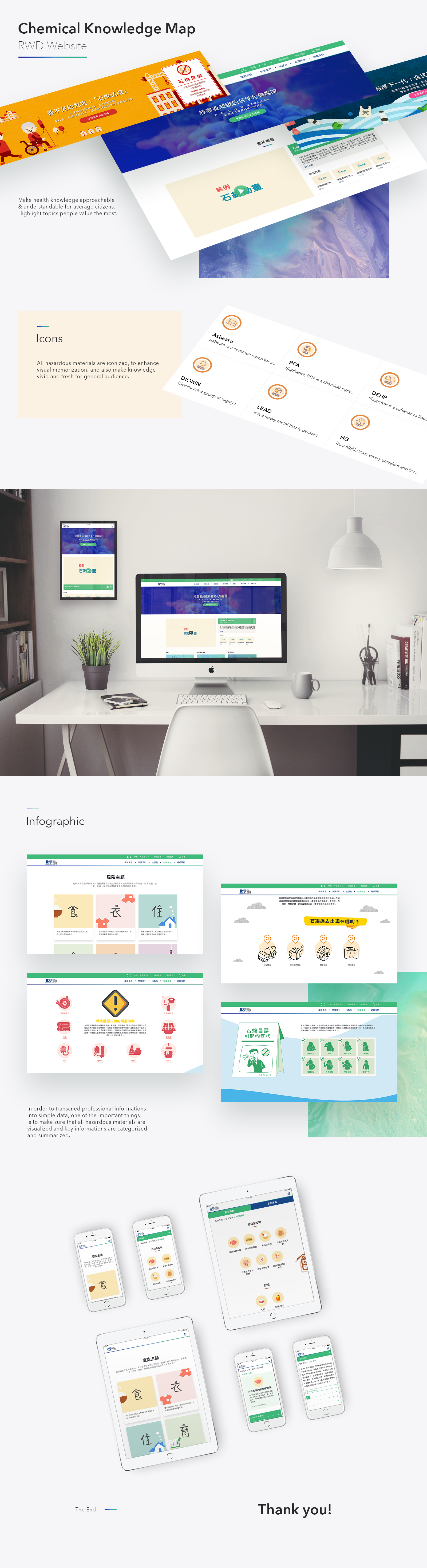
Every category, sub-category, and chemical entry has a corresponding custom illustration character. Characters are friendly and slightly anthropomorphic — designed to signal that this content is approachable, not threatening. The illustration system was designed to scale: the same visual language covers 200+ chemical entries without feeling repetitive.
Approachability
Warm, Character-Led Visuals
Characters greet users at every landing page. The visual warmth earns trust before any chemical data is shown — essential when content could otherwise feel alarming or inaccessible to a general audience.
Scalability
Icon System at 200+ Entries
The iconographic design system covers every entry in the chemical dictionary. Colour-coded by category, consistent in style, and compact enough to work at 40px — ensuring the catalogue remains browsable even at scale.
Infographic
Detail Pages — Data Without Walls
Chemical detail pages replace dense regulatory text with infographic layouts: hazard levels shown as visual scales, exposure routes as illustrated diagrams, and safety precautions as icon-tagged cards. The data is all there — it just no longer requires a chemistry degree to parse.
Gamification
Progress Mechanics for Deeper Learning
The knowledge map tracks which chemicals a user has explored, revealing a visual "completion" state as more entries are visited. This progress mechanic — borrowed from game design — transforms passive reading into active discovery, increasing both dwell time and retention.